

Blog

What Are Barrier Films and Why Are They Important?
Barrier films play a pivotal role in a wide range of industries, providing protection and extending the lifespan of the products they wrap. But what exactly are these films, and why has their importance skyrocketed in recent years? Dive into the world of barrier films with us to uncover their significance and applications across various sectors.
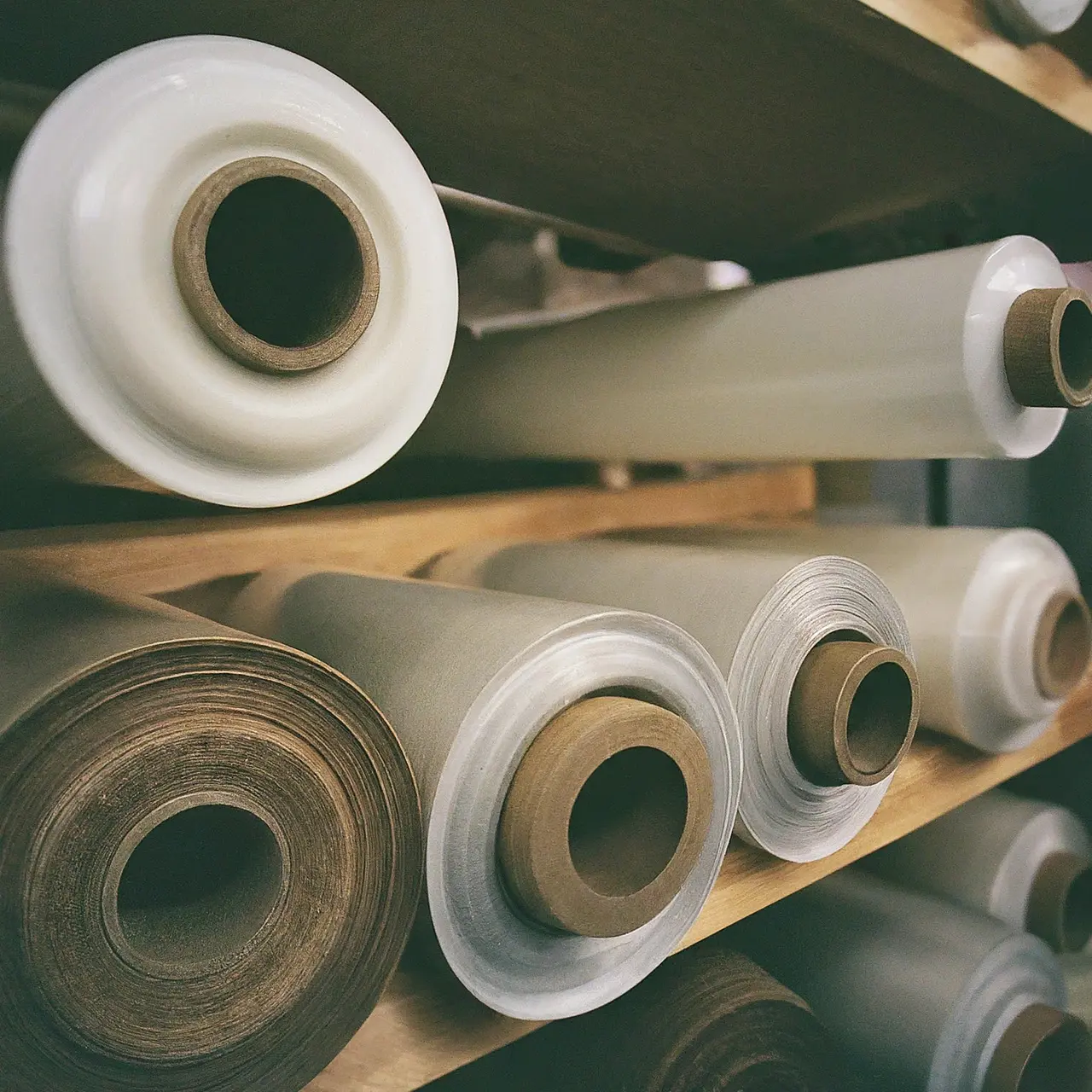
Understanding Barrier Films
At its core, a barrier film is a type of material specifically designed to prevent the permeation of gases, vapors, or liquids. By acting as a protective shield, barrier films play an essential role in maintaining the quality and shelf life of a wide variety of products.
This protective feature is what stands barrier films apart from ordinary packaging materials. They are engineered with precision to target specific environmental factors, such as moisture and oxygen, which can significantly impact the stability and usability of a product.
The composition of barrier films can vary greatly depending on their intended use. Materials range from metals like aluminum to various types of plastics and polymers, each offering different levels of protection and flexibility.
Different Types of Barrier Films
Barrier films come in several types, each tailored for specific applications. For example, metallized films are brilliant for snack packaging due to their reflective properties and robust barrier against light and gases.
On the other hand, ethylene-vinyl alcohol (EVOH) films are admired for their exceptional barrier qualities against gases, making them ideal for food packaging where freshness is paramount.
Transparent barrier films, such as those made from polyvinylidene chloride (PVDC), are sought after in the market for their superior moisture resistance while still allowing the product to be visible.
Why Barrier Films Are Important
The significance of barrier films cannot be overstated. They ensure that food remains fresh, electronics stay dry, pharmaceuticals retain their efficacy, and cosmetic products maintain their quality over time.
Without the protective properties of barrier films, many products would have a significantly shorter shelf life, leading to more waste and higher costs for consumers and businesses alike.
Moreover, these films support global trade by allowing for the safe transport of perishable goods over long distances, making international cuisines and exotic products more accessible to consumers worldwide.
Applications of Barrier Films
From industrial goods to household items, the applications of barrier films are vast and varied. Notably, the food industry relies heavily on these films for packaging everything from meat and cheese to snacks and ready meals.
In the medical field, barrier films are used to seal and protect medical devices and pharmaceuticals, ensuring sterility and preventing contamination.
Beyond these, barrier films are also present in the electronics industry, where they safeguard components from moisture and environmental damage, and in the beauty sector, keeping cosmetics and skincare products stable and hygienic.
Innovations in Barrier Film Technology
The landscape of barrier film technology is rapidly evolving, with an emphasis on improving performance and environmental sustainability. Innovations include the development of biodegradable barrier films that break down naturally without harming the environment.
Another cutting-edge advancement is the creation of thinner, more effective films that require less material without compromising barrier integrity, thus reducing waste and cost.
Researchers are also exploring new materials and coatings that enhance the barrier properties of films, such as nanotechnology-based solutions, to protect sensitive products more effectively.
Choosing the Right Barrier Film for Your Needs
Selecting the appropriate barrier film is crucial for ensuring product safety and longevity. The key is to understand the specific barrier needs of your product, whether it’s protection from moisture, gases, UV light, or a combination of factors.
Consultation with manufacturers can provide insights into the latest technologies and materials suited for your application, helping you make an informed decision that aligns with your product requirements and sustainability goals.
Additionally, considering factors such as the recyclability and biodegradability of the film material can contribute to a more sustainable product lifecycle.
Sustainability and Future Trends in Barrier Films
The drive towards sustainability is shaping the future of barrier films, with a growing demand for eco-friendly alternatives that do not compromise on performance.
Biopolymers and other renewable materials are gaining traction as sustainable options for barrier films. These materials not only reduce the dependence on fossil fuels but also offer the potential for composting and recycling, aligning with circular economy principles.
As technology advances, we can anticipate breakthroughs that will further enhance the sustainability, efficiency, and effectiveness of barrier films, making them even more indispensable in our daily lives and industries.
Wrapping Up on Barrier Films
Barrier films have transformed product packaging and preservation, offering solutions that significantly extend shelf life, maintain product integrity, and enhance consumer satisfaction. As we continue to push the boundaries of material science, the future of barrier films looks promising, with sustainability and innovation at its core. Undoubtedly, the importance and reliance on these protective films will only increase, making their understanding and application critical for businesses aiming for success and responsibility in their industries.

Top 9 Trends in Blister Packaging Design for 2023
As we look forward to the new year, the blister packaging industry is not standing still. Innovations abound, and the upcoming trends are shaping up to make packaging not only more appealing but also more functional and sustainable. Whether you’re a product designer, manufacturer, or simply intrigued by packaging trends, let’s dive into what 2023 has in store for us in the realm of blister packaging.

1. Eco-Friendly Materials Take the Lead
In the continuously evolving landscape of blister packaging, a significant shift towards eco-friendly materials dominates the industry’s focus. Manufacturers are now prioritizing the use of biodegradable, recycled, and renewable resources over traditional plastic. This move not only caters to the growing consumer demand for sustainability but also aligns with global efforts to reduce carbon footprints.
2. The Rise of Smart Packaging
Smart packaging is revolutionizing the way we interact with products. Incorporating technology, such as QR codes and NFC (Near Field Communication), blister packaging is becoming more than just a protective exterior. It’s a gateway to rich digital content, from instructional videos to authenticity verification, enhancing the overall consumer experience and engagement.
3. Minimalism in Design
As the saying goes, ‘less is more,’ and this could not be truer for blister packaging design in 2023. The trend leans towards simple, clean aesthetics that emphasize product visibility and straightforward messaging. This minimalist approach not only appeals to the modern consumer’s taste but also minimizes the use of materials, further supporting sustainability goals.
4. Focus on Consumer Convenience
Consumer convenience remains a top priority in blister packaging design. Innovations in user-friendly features like easy-open tabs and resealable closures are becoming more prevalent. This focus on practicality ensures that packaging does not only serve its primary purpose of protection but also enhances the unboxing experience, adding value to the overall product offering.
Moreover, with the increasing prevalence of e-commerce, blister packages are being designed to be more compact and durable, ensuring products survive the shipping process and arrive in perfect condition. This trend is a testament to the packaging industry’s adaptability to the changing retail landscape.
5. Enhanced Product Security Features
Enhancing product security is another key trend that continues to gain momentum, with blister packaging incorporating features like tamper-evident designs and anti-counterfeiting measures. These advancements not only protect the integrity of the product but also build consumer trust, which is vital in today’s market.
6. Interactive Packaging Through AR
One of the most futuristic trends in blister packaging is the integration of Augmented Reality (AR). By scanning the packaging with a smartphone, consumers can access a wealth of information and interactive content. This could range from detailed product usage instructions to engaging brand stories, making the packaging an essential part of the consumer journey.
7. Personalization and Customization
The desire for personalization and customization is driving blister packaging designs to become more flexible, allowing for limited editions, seasonal offerings, and personalized messages. This trend not only meets the consumer’s demand for unique products but also enables brands to differentiate themselves in a crowded marketplace.
8. Sustainability Beyond the Material
Sustainability efforts in blister packaging are expanding beyond just the use of eco-friendly materials. The entire lifecycle of the packaging, including its ability to be reused, recycled, or composted, is being considered. Manufacturers are also examining their production processes to minimize energy use and waste, reflecting a holistic approach to sustainability.
9. Innovative Form and Function
In 2023, the form and function of blister packaging are being reimagined to cater to both aesthetic appeal and practical utility. From designs that enhance product visibility to structural innovations that improve the packaging’s strength and reduce material use, the fusion of form and function is leading the way in packaging design innovations.

The Impact of Metallic Labels on Shelf Presence
When it comes to standing out on the crowded shelves of today’s stores, every detail counts. Among these, metallic labels have emerged as a powerful tool to catch the consumer’s eye. Let’s dive into the shiny world of metallic labels and see how they can transform the presence of any product on the shelf.

The Psychology Behind Metallic Labels
Have you ever wondered why metallic labels grab your attention so effortlessly? It’s all rooted in psychology. Humans are naturally attracted to things that shine; it’s a survival instinct that dates back to when our ancestors were drawn to shimmering rivers and sources of water. In the modern retail environment, metallic labels play into this primal attraction by standing out amongst a sea of matte-finished products. This magnetic pull towards metallics can significantly boost the perceived value of a product, making it more likely that a consumer will pick it up off the shelf.
Moreover, the color and brightness of metallic labels can significantly affect consumer perception. Gold and silver, for example, are often associated with luxury and high quality. When consumers see a product adorned with these colors, they subconsciously relate the product to these attributes, making the choice to purchase easier. This psychological link between color, material, and perception is a cornerstone for why metallic labels are so effective in enhancing shelf presence.
Comparing Metallic Labels to Traditional Labels
When we put metallic labels side by side with traditional paper labels, the contrast in shelf impact is stark. Traditional labels, while versatile and cost-effective, can easily blend into the background in a retail setting. Metallic labels, on the other hand, reflect light and catch the eye, providing a dynamic visual experience. This isn’t just about aesthetics; it’s about visibility. In a consumer study, products with metallic labeling were noticed significantly quicker than those with non-metallic labels, suggesting that metallic labels can make a product more likely to be seen and, subsequently, purchased.
Furthermore, the durability of metallic labels is another factor to consider. They often withstand environmental factors better than paper labels, resisting fading and wear over time. This durability not only maintains the attractiveness of the product but also signals quality to the consumer. A label that remains intact and shiny over time reassures customers of the product’s quality, potentially influencing their loyalty and repeat purchases.
Design Considerations for Metallic Labels
Designing a metallic label requires a careful balance of creativity and restraint. The goal is to create a label that stands out but also complements the product. Designers often use metallics as highlights or accents to draw attention to certain elements of the label, like the brand name or a specific feature of the product. This technique, known as spot metallic printing, allows for the strategic use of metallic effects without overwhelming the entire design.
Additionally, the choice of colors and textures plays a significant role in the overall effectiveness of a metallic label. Combining metallic elements with matte finishes can create a sophisticated contrast that elevates the product’s shelf appeal. Moreover, considering the product and its packaging when designing the label is crucial. For instance, a metallic label on a matte black bottle can create a sleek, modern look, while a bright, textured metallic label might be more fitting for a more vibrant, playful product.
Case Studies: Success Stories with Metallic Labels
One notable success story comes from a premium vodka brand that redesigned its labels with a silver metallic finish. This simple change led to a dramatic increase in visibility and, subsequently, a 20% uplift in sales over the holiday season. The new label didn’t just signify luxury; it made the bottle stand out on a crowded liquor store shelf, grabbing the attention of holiday shoppers looking for a special gift.
Another example is a boutique coffee brand that introduced gold metallic labels for its limited-edition range. The result was an immediate perception of exclusivity and quality, helping the brand to command a higher price point. The metallic labels served as a key differentiator in a competitive market, contributing to an impressive 30% increase in sales for the limited-edition range.
Implementing Metallic Labels into Your Branding Strategy
Integrating metallic labels into your branding strategy requires thoughtful consideration of your brand identity and target market. The allure of metallics can be highly effective for premium and luxury products, but it’s also possible to incorporate them in a way that appeals to broader markets. The key is to ensure that the use of metallics aligns with your product’s positioning and enhances its shelf appeal without detracting from the brand message.
Collaborating with experienced designers and label manufacturers can help you navigate the possibilities and limitations of metallic labeling. They can provide insight into the latest trends, materials, and technologies, such as digital metallic printing, that can make the implementation of metallic labels both feasible and efficient. Ultimately, the decision to incorporate metallic labels should be driven by a desire to elevate your product’s presence on the shelf and create a lasting impression on consumers.
A Shiny Conclusion
Metallic labels, with their unique ability to attract attention and evoke a sense of quality, play a significant role in the competitive retail environment. Incorporating them into your product packaging strategy can elevate your brand’s shelf presence and potentially increase your product’s appeal to consumers. Remember, in a sea of sameness, a little shine can go a long way.

Sustainable Solutions: Eco-Friendly Cosmetic Packaging Trends
In a world increasingly aware of the impact of its choices, the cosmetic industry is shifting towards sustainable solutions that are both beautiful and beneficial for our planet. Discover how eco-friendly cosmetic packaging is not just a trend, but a movement towards a cleaner, greener future.

The Urgency of Switching to Eco-Friendly Cosmetic Packaging
The move towards eco-friendly cosmetic packaging is driven by a pressing need to reduce environmental damage. Packaging plays a monumental role in the beauty industry’s carbon footprint, often ending up in landfills or as ocean debris. This push for sustainability isn’t just about nodding to environmental awareness; it’s a call to action for businesses and consumers alike to adopt more responsible practices. By embracing eco-friendly packaging, the cosmetic industry can significantly lower its environmental impact, offering products that consumers can feel good about on multiple levels.
Traditional packaging solutions are fraught with problems – from non-recyclable materials to excessive use of plastics. Recognizing this, many brands are now exploring biodegradable, recycled, and refillable options. This not only helps in significantly reducing waste but also conserves resources and minimizes pollution. The urgency of this switch cannot be understated, as it represents a critical step towards sustainability in an industry historically known for its lavish, but often wasteful, packaging.
Breaking Down the Benefits of Sustainable Packaging
Eco-friendly cosmetic packaging offers a myriad of benefits, both environmental and economic. Firstly, sustainable packaging greatly reduces the depletion of natural resources, using materials that are either readily renewable or recyclable. This not only lessens the environmental footprint of cosmetic products but also appeals to the growing segment of environmentally conscious consumers. Furthermore, sustainable packaging can lead to cost savings in the long run, through the use of more efficient, streamlined designs that minimize waste and the potential for reduced shipping costs thanks to lighter, more compact packaging.
Another benefit is the positive brand image and loyalty garnered from demonstrating a commitment to sustainability. Today’s consumers are increasingly looking to support brands that align with their values, particularly when it comes to environmental responsibility. By investing in eco-friendly packaging, cosmetic brands not only contribute to the preservation of the planet but also build stronger connections with their customers, fostering a sense of shared values and purpose.
Innovative Materials Revolutionizing Cosmetic Packaging
The search for sustainable alternatives has led to an explosion of innovative materials in cosmetic packaging. Materials such as bioplastics, derived from natural resources like corn starch or sugarcane, offer a renewable, biodegradable solution that significantly reduces the industry’s reliance on fossil fuels. Similarly, bamboo has emerged as a popular choice, favored for its rapid growth and biodegradability. These materials are not only eco-friendly but also offer unique aesthetic and tactile qualities, adding a luxurious touch to sustainable beauty products.
Advancements in packaging technology have also enabled the creation of refillable designs that encourage consumers to reuse containers rather than dispose of them. This approach not only minimizes waste but also reinforces a brand’s commitment to sustainability. Technologies that enable better recycling processes are being developed, aiming to close the loop on cosmetic packaging and ensure that beauty products contribute positively to the environmental equation.
How Brands are Implementing Eco-Friendly Packaging Solutions
Leading cosmetic brands are setting powerful examples by integrating eco-friendly packaging into their products. From using post-consumer recycled (PCR) materials to offering refill stations in stores, these brands are redefining what it means to be luxurious and responsible. Some are even embarking on zero-waste initiatives, eliminating all unnecessary packaging and switching to fully compostable or recyclable solutions. These efforts not only help in preserving the environment but also in meeting the increasing demand from consumers for sustainable options.
The Future of Cosmetic Packaging: Trends to Watch
The future of cosmetic packaging is bright, with sustainability at its core. Emerging trends include the rise of digital printing techniques to reduce waste and enhance personalization, and the development of ‘smart’ packaging that extends the shelf life of products, reducing the need for preservatives and minimizing waste. Furthermore, the use of augmented reality (AR) in packaging is on the rise, providing consumers with a more interactive experience while also allowing brands to reduce their physical packaging needs. These trends showcase the industry’s dedication to innovation and sustainability, promising a greener, more inclusive future for beauty enthusiasts everywhere.
Embracing the Beauty of Sustainability
The journey towards sustainable cosmetic packaging is far from over, but with each innovative material, redesigned package, and brand commitment to eco-friendly practices, we’re moving closer to a future where beauty doesn’t come at an environmental cost. These evolving trends in cosmetic packaging not only reflect the industry’s creativity and ingenuity but also its collective responsibility towards our planet. As consumers continue to drive demand for sustainability, the cosmetic world stands at the forefront of significant, positive change, proving that beauty and eco-consciousness can indeed go hand in hand.

The Essential Guide to Designing Captivating Condiment Labels
Designing condiment labels is not just about making them look nice on the shelf. It’s about telling a story, enticing the consumer, and conveying the essence of what’s inside the bottle, jar, or package. In this essential guide, we’ll dive into the art and science behind captivating condiment label design with a simple, friendly, and engaging tone.

The Importance of Eye-Catching Design
In the world of condiments, standing out on a crowded shelf is the first step toward getting into the consumer’s basket—and heart. An eye-catching design isn’t just about bold colors or flashy graphics; it’s about making an immediate connection with the shopper. This visual appeal is crucial, as it can dictate whether your product is noticed or lost in an ocean of competitors. Crafting a label that captures attention requires a keen understanding of design principles and a dash of creativity. It’s a balancing act between being unique and maintaining clarity about what the product offers.
Consider for a moment the sensory overload consumers face as they walk down aisles filled with products clamoring for attention. Your label is your ambassador, whispering (or shouting) your brand’s message. From font choices to color schemes, every detail contributes to the overall impact. An unforgettable label design goes beyond aesthetics; it triggers emotions and memories, inviting the consumer to a unique experience. Therefore, the process of creating an eye-catching design should begin with the question: ‘What feeling do we want to evoke in the consumer?’ Answering this could be the key to unlocking your product’s potential.
Understanding Your Audience
Who are you speaking to with your condiment label? Knowing your audience is pivotal in designing a label that appeals directly to their preferences, needs, and desires. Different demographics may prioritize different aspects of a product—organic ingredients, bold flavors, or perhaps eco-friendly packaging. Tailoring your design to reflect these priorities can significantly enhance its appeal. Engaging with your target audience through market research, social media interactions, and feedback loops can provide invaluable insights into their world. By deeply understanding who your consumers are, you’re better equipped to create designs that resonate, communicate, and ultimately convince them to choose your brand.
Typography and Its Impact
The typeface on your condiment label does more than just spell out the name. It’s a critical element that plays into the overall feeling your label imparts. Each font has its own personality, whether it’s the traditional elegance of a serif font, the modern simplicity of sans serif, or the playful quirkiness of a script. The right typography can convey your brand’s story and ethos without a single word being read. However, legibility should never be sacrificed for style. After all, your label has important information to communicate, and you want this done as clearly as possible. Striking the right balance between artistic expression and functional clarity is essential.
Choosing the Right Colors
Color psychology plays a pivotal role in condiment label design. The colors you choose can influence mood, evoke emotions, and even trigger appetite. Understanding the psychological effects of certain colors can greatly inform your design choices. Warm colors like red and yellow can stimulate appetite, making them great choices for condiment labels. However, the context of your product—whether it’s a fiery hot sauce or a gourmet mustard—should guide your color selection. Balancing your brand’s personality with the psychological implications of your color choices can create a visually appealing and emotionally resonant label.
But colors do more than evoke feelings; they communicate values and characteristics. Green, for instance, might signify natural or organic qualities, which could align well with eco-conscious brands. The key is consistency. Ensure that the color scheme of your condiment label aligns with your brand’s overall aesthetic and messaging. This alignment helps reinforce brand recognition, making your products easily identifiable on the shelves. It’s a complex interplay of aesthetics, psychology, and marketing that, when done right, leads to a captivating and successful condiment label design.
Balancing Information with Design
While aesthetics play a crucial role in attracting attention to your condiment labels, it’s equally important to communicate the key information clearly and effectively. This includes the product name, ingredients, nutritional information, and any unique selling propositions. The challenge lies in presenting this information in a way that doesn’t clutter or detract from the overall design. Creative solutions, such as innovative typography and strategic use of whitespace, can ensure that your label communicates everything it needs to without overwhelming the consumer. It’s about striking a perfect harmony between informative and inviting.
Incorporating Brand Identity
Your condiment label is more than just a sticker on a bottle; it’s a storytelling canvas that conveys your brand’s identity, values, and promise. Every element—from the logo to the color palette and typography—should reflect the ethos of your brand. A consistent brand identity not only builds recognition but also trust with your consumers. They come to know what your brand stands for and what to expect from your products. This consistency across your product range reinforces your presence in the market, making your products easily recognizable among a sea of competitors.
Regulatory Requirements for Labeling
Navigating the regulatory requirements of condiment label design is crucial for compliance and ensuring consumer safety. These regulations can cover everything from mandatory nutrition information to ingredient lists and allergen declarations. Familiarizing yourself with the relevant regulations in your market is essential to avoid costly redesigns or legal issues. While compliance is mandatory, finding creative ways to incorporate this information into your design without compromising aesthetics is a true test of design ingenuity. It requires close collaboration between designers and regulatory experts to ensure that legal requirements are met while maintaining the visual appeal of the label.
Testing and Feedback
Designing the perfect condiment label is rarely a one-shot affair. It involves iteration, testing, and plenty of feedback. Presenting your label designs to focus groups or conducting online surveys can provide crucial insights into how your target audience perceives your label. What stands out? What confuses them? This feedback loop can be invaluable in refining your label to ensure it not only looks great but also resonates with your intended market. Incorporating user feedback into your design process helps bridge the gap between aesthetic appeal and market reality, leading to a more successful product launch.
Crafting Labels That Tell a Story
Creating a captivating condiment label is a journey that combines creativity with strategy. From understanding the importance of typography and color to incorporating elements that resonate with consumers, every detail counts. By following the principles outlined in this guide, aspiring designers and seasoned professionals alike can craft labels that do more than just inform; they enchant, persuade, and create a memorable brand experience. So, grab your creative toolkit, and let’s make those shelves a little more intriguing!

What Makes Metallic Labels Different from Other Label Types?
Metallic labels have a unique charm and functionality that sets them apart from other label types. In this guide, we’ll explore what makes them stand out—in the simplest terms possible.

The Sparkle Factor: Visual Appeal of Metallic Labels
Metallic labels carry an inherent sparkle that instantly elevates the visual appeal of any product they adorn. This sparkle isn’t just about looking pretty; it plays a crucial role in attracting consumer attention on crowded store shelves. The reflective surface of metallic labels catches the light, making products more noticeable and desirable to potential buyers.
But it’s not all about the shine; metallic labels also add a perception of higher quality to products. This perception can significantly influence a buyer’s decision-making process, suggesting that the product is of superior standard, thus justifying a higher price point. It’s this strategic use of metallic labels that can truly make a brand stand out in a competitive market.
Durability and Resistance: How They Stand Up to the Elements
Durability is another hallmark of metallic labels. Unlike paper labels, metallic labels are highly resistant to wear and tear. They can withstand exposure to elements such as water, oil, and various chemicals without deteriorating. This makes them an excellent choice for products that face harsh conditions during shipping, storage, or even use.
Moreover, the resilience of metallic labels means they maintain their premium look and feel for longer. This lasting appeal is vital for brands that want to ensure their products continue to communicate quality and sophistication, even after prolonged exposure to less-than-ideal conditions.
Versatility in Uses: Where Metallic Labels Shine the Brightest
Metallic labels aren’t just for luxury items; their versatility makes them suitable for a broad range of products. From food and beverage to beauty products, and even automotive parts, metallic labels can enhance the product presentation across various industries.
This versatility also extends to the types of metallic labels available. From foil stamps to metallic inks, there are multiple ways to achieve the metallic effect, each offering its unique advantages. This allows brands to select the best option that aligns with their product needs and branding strategy.
Cost-Effectiveness: Evaluating the Investment
At first glance, metallic labels might seem like a costlier option compared to standard labels. However, when considering the value they add to product presentation and the potential increase in sales due to their eye-catching nature, they can be a cost-effective choice for many brands.
Furthermore, advancements in printing technology have made the production of metallic labels more accessible and affordable. This means that even small to mid-sized businesses can consider incorporating metallic labels into their packaging without breaking the bank.
The Printing Process: How Metallic Labels are Made
The creation of metallic labels involves specialized printing techniques. One common method is foil stamping, where a metallic foil is pressed onto the label material using heat and pressure. Another method is the use of metallic inks in the printing process, which can achieve a similar effect without the texture of foil stamping.
Each method offers a different aesthetic and tactile experience, giving brands the flexibility to choose the perfect finish for their products. The choice between foil stamping and metallic ink depends on the desired outcome, budget, and application process.
Environmental Impact: Are Metallic Labels Eco-Friendly?
The environmental impact of metallic labels is a concern for eco-conscious brands. While metallic labels add a unique appeal to products, it’s important to consider their recyclability and the sustainability of the materials used.
Fortunately, there are eco-friendly options available for businesses striving for sustainability. Some metallic labels are designed to be recyclable, and the use of certain metallic inks can minimize environmental impact. It’s crucial for brands to work with label manufacturers who prioritize eco-friendly practices to ensure their packaging aligns with their sustainability goals.
Why Choose Metallic Labels?
Understanding the distinct qualities of metallic labels can significantly influence your packaging strategy, adding a level of sophistication that’s hard to achieve with regular labels. Whether it’s their durability, attractiveness, or their ability to catch the consumer’s eye, incorporating metallic labels into your product packaging can set your brand apart.