+1 (844) 374-5257
Call us for any questions

Blog

Read our thoughts on the latest innovations and developments in the packaging industry.
image 6
image 6

How Stick Packs are Changing the Game in Flexible Packaging

Introduction to Stick Packs and Their Rising Popularity

Stick packs are thin, small, and rectangular packages you’ve likely seen for powders, gels, or liquids. They’re a hit because they’re convenient to use, carry, and store. Imagine being able to carry your favorite coffee, vitamins, or energy drinks in your pocket, ready to mix into water whenever you want—that’s the power of stick packs. They’re gaining ground fast, especially in health, beauty, and food sectors. This surge in popularity isn’t just about convenience though. Stick packs use less material, making them a lean choice for brands focused on cutting down waste and costs. Plus, with less packaging, they’re better for the planet. Easy for you, good for the environment—stick packs are clearly winning the game in flexible packaging.
Graceful woman performing variation of Setu Bandha Sarvangasana yoga pose

The Evolution of Flexible Packaging

Once, we only had bulky boxes and cumbersome containers, but now, flexible packaging has taken the front stage, offering sleek, consumer-friendly solutions. This shift is largely due to innovations like stick packs. Stick packs? Yes, those slim, tube-shaped packets you see for everything from sugar to shampoo. They’re why flexible packaging is evolving. Less material, less waste, and more product capacity have driven this trend. Manufacturers love them because they’re cheaper to produce and ship. Also, they use up to 40% less material than traditional packets. For consumers, they’re just easier to carry, use, and dispose of. Plus, they’re perfect for on-the-go lifestyles. In short, the evolution of flexible packaging, marked by the rise of stick packs, is a win-win. Smarter for businesses, better for consumers, and kinder to our planet.

What Are Stick Packs? A Definition

Stick packs are thin, tube-shaped packaging solutions that hold everything from powders to liquids. Think of them like the slender cousins of the traditional packet but way cooler because they use less material and are super easy to carry around. They’re not just about looking good; they’re practical. The design means you get just the right amount in every pack, reducing waste and making your life easier. They’re popping up everywhere, in industries from food to pharmaceuticals, because they’re efficient, convenient, and let’s not forget, eco-friendlier than bulkier options. So, in short, stick packs are the sleek, smart packaging choice that’s winning over both businesses and consumers.

The Advantages of Using Stick Packs

Stick packs are not just another trend in the packaging world; they’re changing the game for businesses and consumers alike. Their sleek design allows for convenience, portability, and reduced waste, making them an ideal choice for packaging everything from coffee and tea to condiments and pharmaceuticals. First, they save space. With their slim profile, stick packs use less material and can be packed more efficiently, leading to lower shipping and storage costs. This is a win for both the environment and the bottom line. Second, they’re incredibly user-friendly. Easy to open, carry, and use on the go, stick packs offer a level of convenience that traditional packaging can’t match. This is particularly appealing in today’s fast-paced world where convenience is key. Lastly, stick packs are customizable. They can be tailored to fit any brand’s visual identity, making them a powerful marketing tool. The flexibility in design helps businesses stand out on the shelf and leave a lasting impression on consumers. In short, stick packs are a smart choice for businesses looking to improve efficiency, enhance user experience, and make a strong brand statement.

Variety of Products That Benefit from Stick Pack Packaging

Stick pack packaging isn’t just for one industry; it’s revolutionizing the way a variety of products hit the shelves and land in consumers’ hands. From health supplements that keep us on our game to single-serving coffee packs that make our mornings more manageable, stick packs are everywhere. Health and wellness products love stick packs for their ease of use and the way they keep powders and liquids at just the right serving size. Think protein powders, vitamins, and even electrolytes that you can toss in your bag on the go.

But it doesn’t stop there. Coffee and tea companies are also jumping on the stick pack bandwagon. The reason? Convenience. Now, instead of measuring out coffee grounds, you can just rip open a pack, pour it into your cup, add hot water, and you’re good to go. Instant energy drinks are another big fan. They’re perfect for a quick energy boost without the bulk of a can or bottle.

The beauty and personal care sectors are tapping into stick packs, too. Face masks, shampoos, and creams in stick packs make it super easy for travelers to carry them without worrying about spills or TSA limits.

In a nutshell, if a product benefits from exact portion control, on-the-go convenience, and reduced packaging waste, there’s a good chance stick pack packaging could be a game-changer for it. From the foods we eat to the products we use to look and feel our best, stick packs are making life easier, one little packet at a time.

How Stick Packs Contribute to Sustainability Efforts

Stick packs are stepping up the game in packaging with their eco-friendly edge. These slender packets are not just saving space but are also slashing waste. Here’s the deal: compared to traditional packaging, stick packs use about 40% less material. That means we’re talking about a massive cutback in the production resources used – think less plastic, less energy, and fewer emissions. It’s a win-win. Plus, their compact size makes them super easy to transport. This means trucks can carry more goods in one go, leading to fewer trips and, you guessed it, lower carbon emissions. And when it comes to the end of their life, stick packs being lighter and smaller, contribute to less waste ending up in landfills. So, with every stick pack, we’re not just enjoying convenience; we’re also doing our bit for the planet. It’s pretty clear, stick packs aren’t just changing the game in packaging; they’re helping lead the charge towards a more sustainable future.

The Manufacturing Process of Stick Packs

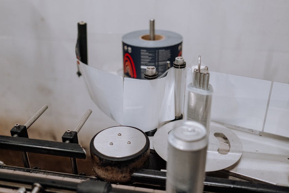
Stick packs, those slender little packets you often see containing powders or liquids, are made through a rather fascinating process. First, giant rolls of film are fed into a stick pack machine. Think of this like a massive printer that instead of ink, adds designs and product details onto the film. The key here is precision. These machines sharply cut the film into long, narrow strips, ensuring each stick pack will be identical.

Then, we move onto the filling. For powders, a precise amount is funneled into each stick pack. It’s a game of accuracy; too much or too little, and the product won’t meet standards. For liquids, the process is similar but involves pumps to inject the right quantity into each pack.

Sealing is next up in the process. Stick pack machines apply heat to the edges, melting the film slightly to seal it shut. This step is crucial. A perfect seal keeps the product fresh and prevents leaks.

Lastly, the sealed stick packs are cut apart from the main roll, inspected for quality, and then packed for shipping. Each of these steps is key to producing stick packs efficiently and to high standards. This manufacturing process allows for a lot of products to be packaged quickly, changing the game in flexible packaging by offering convenience, reduced material use, and innovative branding opportunities.

Comparing Stick Packs to Traditional Packaging Solutions

Stick packs are shaking things up in the world of packaging, and here’s why they’re winning against traditional packaging solutions. First, stick packs use less material. That’s right, they’re slim, which means they don’t demand as much plastic or aluminum as your average packet or box. This not only cuts down on waste but also makes them lighter and reduces shipping costs.

Second, they’re super convenient. Designed for on-the-go consumption, stick packs fit easily into your pocket, purse, or lunchbox. Forget about messes or the need to measure; just tear, pour, or eat straight from the pack.

Third, there’s the cost aspect. With less material used and lower shipping weights, stick packs can be cheaper to produce in the long run. For brands, this means potential savings without sacrificing quality.

Lastly, we can’t ignore the environmental benefit. Less material equals less waste, making stick packs a friendlier choice for our planet. When it comes to sticking it to traditional packaging, stick packs have the edge in efficiency, convenience, cost, and sustainability.

Stick pack packaging isn’t just sticking around; it’s set to soar. With consumers craving convenience, portability, and sustainability, brands are listening up and leaning into this trend. The future? It looks like a world where single-serve packets dominate, from vitamins to coffee, and everything in between. Here’s the deal: eco-friendly materials are on the rise. Consumers want to feel good about what they’re buying, pushing brands to swap traditional plastics for biodegradable or recyclable options. Innovation doesn’t stop there. Expect to see smarter designs that are easier to open, dispense from, and store. But it’s not just about being green or user-friendly. Digital printing technologies are getting a workout, allowing for hyper-personalized packets. Imagine stick packs as your new canvas for creativity, with vibrant colors and eye-catching graphics tailored to niche markets or individual customers. The bottom line? Stick pack packaging is evolving rapidly, driven by a mix of consumer desires and technological advances. It’s a win-win: products become more accessible and brands stand out on the shelves. Keep your eyes peeled; the revolution in packaging is just getting started.

Conclusion: The Impact of Stick Packs on Consumer Experience and Industry Standards

Stick packs are not just another trend; they’re reshaping how we think about packaging and consumption. By offering convenience, reducing waste, and providing cost-effective solutions for brands, these slender packets are making a big impact. Consumers love the ease of carrying and using stick packs, whether it’s for a quick coffee fix or a nutrient-packed supplement. This preference is pushing companies to innovate, leading to a surge in demand for flexible packaging solutions. On the industry side, standards are evolving. The shift towards stick packs is encouraging manufacturers to adopt more efficient, sustainable practices. In essence, stick packs are paving the way for smarter, more consumer-friendly packaging. This change is more than just practical; it’s setting new benchmarks for how goods are packed, sold, and enjoyed.

Read More
image 5
image 5

Designing Condiment Labels: Tips from Industry Experts

Understanding the Importance of Condiment Labels

Condiment labels do more than just tell you what’s inside the bottle. They’re a key player in the game of grabbing a shopper’s attention. Imagine walking down an aisle packed with options. A condiment label has the power to make a shopper reach out for that specific product. It’s your product’s handshake, its first impression. Labels convey the brand’s essence, ingredients, and even a hint of the company’s personality. They need to stand out, speak directly to the buyer, and make a promise about the taste adventure inside. Labels are not just about looks; they’re about communication. They must meet legal requirements, listing ingredients, and nutritional info, but how this information is presented can dramatically affect a product’s appeal. A well-designed label can tell a story, evoke emotions, and even build loyalty. That’s the kind of power packed into that little piece of paper wrapped around every bottle and jar.
From above of creative design of smoked ground paprika and turmeric mixed together on black surface

The Basics of Condiment Label Design

Designing a condiment label is not just about making something look good. It’s about catching the eye and telling a story. First things first, know your product. Is it spicy, sweet, or tangy? Your label should match the personality of your condiment. Keep it simple. You’ve got limited space, so every detail on that label has to earn its place. Use clear, easy-to-read fonts and don’t overcrowd the space.

Color is your friend, but choose wisely. Bright colors can make your product pop on the shelf. However, the colors you pick should reflect the flavor of the condiment. A fiery hot sauce? Think reds and oranges. A cool, creamy dressing? Maybe soft greens or blues.

Your brand logo should be front and center. It’s what customers will remember. Make sure it’s visible and reflects your brand’s vibe. Don’t forget the essentials – ingredients, nutritional information, and any allergen warnings. They’re not just legal requirements; some customers look for this first.

Lastly, think about your material and finish. A glossy finish might catch the light, but a matte finish could suggest a premium product. The material should stand up to fridge storage or the occasional spill. Every choice you make tells part of your condiment’s story, so make it count.

Key Elements to Include on Your Condiment Labels

When whipping up your condiment labels, you gotta keep it straightforward yet striking. The main ingredients you should toss into this mix are:

  • The Product Name – Make it big and bold. Your mustard or hot sauce should shout its name from the shelf.
  • Brand Logo – Your logo is like your signature. It tells them who’s behind the magic in the bottle.
  • Net Weight or Volume – This one’s not just helpful, it’s the law. Customers want to know how much bang they’re getting for their buck.
  • Ingredients List – Keep it honest and clear. Folks care about what they’re consuming, especially if allergies are in play.
  • Nutritional Information – Another must-have. Whether your customers are calorie counters or just looking to avoid sugar, this info is gold.
  • Expiration Date – Because no one wants to spice up their dish with last year’s salsa.
  • Barcode – It’s the modern-day magic spell that gets your product from the shelf to the checkout. Plus, it keeps things organized for you and the stores.

Remember, the goal is to make your condiment stand out while keeping everything above board. Stick to these elements, and you’re well on your way to designing labels that catch eyes and comply with the rules.

Choosing the Right Colors and Fonts for Condiment Labels

When deciding on colors and fonts for condiment labels, think about your brand and the message you want to send. Colors can play a huge role in grabbing a customer’s attention. For example, red can evoke feelings of excitement and passion, while green might suggest freshness or organic qualities. But, don’t go overboard. Too many colors can confuse and overwhelm.

Fonts also matter a lot. The right font can make your label readable and help convey the personality of your brand. For a traditional feel, serif fonts like Times New Roman work well. For a more modern, clean look, sans-serif fonts like Arial are a good choice. Remember, the font needs to be easy to read, even from a distance.

Combining colors and fonts effectively can set your condiment apart from the competition. Think about what makes your brand unique and let that guide your choice. Keep it simple, but don’t be afraid to make a statement.

Tips for Making Your Condiment Labels Stand Out

Making your condiment labels pop is simpler than you think. Here’s how. First, focus on color. Bright and contrasting colors catch eyes on shelves packed with options. Just don’t go overboard; your label still needs to breathe. Use colors that reflect your brand and the flavor of the product. Next, clarity is key. Make sure your brand name and product type are easy to read at a glance. No one should squint to know what they’re buying. Font choice matters here—keep it bold but readable. Third, uniqueness sells. Add a twist to your design that speaks to your brand’s personality. Maybe it’s a quirky mascot or an unconventional shape of the label itself. Stand out, but stay true to your brand’s core. Lastly, think about texture. Matte, glossy, or even a tactile feel can make your product memorable once it’s in a customer’s hand. Embrace these tips to ensure your condiment labels aren’t just seen; they’re remembered.

How to Incorporate Branding into Your Condiment Labels

When creating a condiment label, embedding your brand is not just about slapping your logo on the front. Think of your label as the face of your condiment in a crowded marketplace. Your brand identity should scream “pick me” without making a sound. Here’s how:

First, color plays a huge role. Pick colors that match your brand’s vibe. If your brand is all about fun and excitement, go for bright, bold colors. If it’s more about luxury, consider deeper, richer tones. Remember, consistency is key across all your promotional materials, not just the label.

Next, your logo deserves the spotlight but in a way that feels natural, not forced. Place it prominently, but make sure it fits smoothly into the overall design. It shouldn’t stick out like a sore thumb.

Font choice can say a lot about your brand, too. Quirky fonts can convey a fun, approachable brand, while sleek and simple fonts might suggest sophistication. Whatever you choose, make it readable. If customers can’t read your label from a distance, they might pass you by.

Including a catchy tagline or a unique selling point on your label can also enhance your branding. It’s like giving your condiment a voice or a personality that consumers can relate to or remember.

Lastly, consistency is your best friend. Ensure that your condiment labels align with your brand’s overall look and feel across all platforms, from your website to social media to packaging. This creates a cohesive brand image that consumers will recognize and trust.

Incorporating branding into your condiment labels is about making deliberate choices that reflect and promote your brand’s identity. It’s about making your product stand out while also ensuring it fits seamlessly within your brand’s universe.

Before you get creative with your condiment label design, know this: there are laws you’ve gotta follow. The Food and Drug Administration (FDA) sets strict rules on what must be included on food labels, and yes, condiments are on that list. First off, your label must clearly show the product name. No playing games here; people need to know what they’re getting. Then, you need an ingredient list, and it’s got to be in descending order of amount. That means the ingredient you use the most of comes first. You also can’t forget nutrition information. It’s got to be there, clear as day, so folks know what they’re consuming. And remember, allergen labeling is not just important—it’s required. You’re looking out for people’s health here. Lastly, your label needs a net weight statement and your company’s name and address. This isn’t just bureaucracy; it’s about transparency and keeping your consumers informed. So yes, designing a condiment label means playing by the rules. But within those boundaries, there’s plenty of room to make your mark.

Working with Designers: Insights from Industry Experts

When you decide to step into the world of condiment label design, working with professional designers is a game-changer. Experts in the field stress the importance of clear communication. Start by sharing your vision, brand values, and the message you want the label to convey. Designers have the knack for transforming ideas into visual stories, but they need your input to align it with your brand’s ethos. Don’t shy away from giving feedback. It’s crucial for refining concepts and arriving at a design that resonates with your audience. Remember, a successful designer-client relationship is anchored in openness and mutual respect. Also, be mindful of timelines and budget. Experienced designers appreciate when you respect their time and understand the value they bring to your project. In essence, the collaboration is not just a transaction but a partnership aimed at creating something remarkable for your condiment brand.

Common Mistakes to Avoid in Condiment Label Design

When creating condiment labels, designers often trip up on a few common mistakes. Skipping the all-important step of understanding your audience can lead your design astray. Remember, your label should speak to who’s buying it. Overcomplicating the design is another misstep. Labels crowded with too much information or intricate designs confuse customers. Stick to clear, readable fonts and simple graphics that pop. Ignoring your competition can also set you back. Know what’s on the shelves alongside your product; your label should stand out but not be so out of sync it feels alien. Using low-quality images or printing methods can cheapen your product’s look, no matter how great the content inside is. Lastly, forgetting legalities, like nutrition facts or ingredient lists, can get you in hot regulatory waters. A great design balances appeal and practicality, steering clear of these errors.

Wrapping Up: A Checklist for Effective Condiment Label Design

Before sending your condiment label design for printing, here’s a quick checklist to ensure effectiveness and appeal:

  • Know your brand: Your label should reflect your brand’s identity. Is it fun and quirky or elegant and upscale? Your design should match.
  • Clear product name: Make sure the name of your condiment is easy to read and stands out. It’s the first thing customers look for.
  • Legible text: All text, including ingredients and nutritional information, should be clear and easy to read. Don’t let style override readability.
  • Eye-catching graphics: Use colors and images that draw attention but also make sense for your product. Think about what makes your condiment unique and highlight that.
  • Legal requirements: Ensure your label meets all legal requirements, including allergen information and nutritional facts. Skipping this step can get you in trouble.
  • Scannable barcode: A clear, scannable barcode is a must for retail. Double-check its placement and scan-ability.
  • Contact information: Always include your company’s contact information. It’s not just about compliance; it’s about building customer trust.

Keep it straightforward, focus on these elements, and your condiment label won’t just look good; it’ll have the structure it needs to stand out on the shelves.

Read More
image 4
image 4

Innovative Beer Labels Design: How to Stand Out in a Crowded Market

Introduction: The Importance of Beer Labels

In the world of beer, where countless brands vie for attention, your beer label isn’t just a sticker; it’s a storyteller, a brand ambassador, and crucially, a differentiator. The beer label does more than just adhere to a bottle; it conveys the beer’s personality, hints at the flavor inside, and resonates with the customer even before the first sip is taken. Imagine walking down an aisle filled with beers, what makes you pick one over the other? Often, it’s the label. A well-crafted beer label grabs attention, sparks curiosity, and can even become a topic of conversation. It’s not just about bright colors or flashy designs; it’s about creating a connection with the consumer, telling a story that aligns with their expectations, and distinguishing your brew from the sea of sameness. In a market oversaturated with choices, an innovative beer label design is not just important; it’s essential. It turns the bottle into a canvas, the label into art, and beer shopping into an experience. This isn’t just about packaging; it’s about making your beer stand out in a crowded market and leaving a lasting impression on the beer enthusiast.
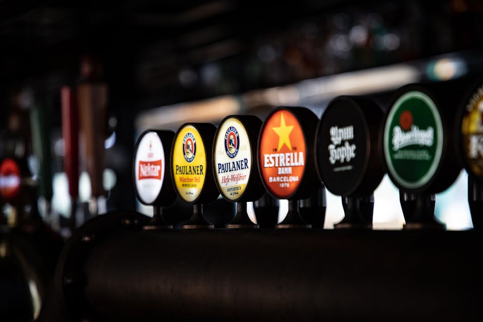
Fancy beer bottle with handle and label with glare on side placed on wooden table in illuminated restaurant

Understanding Your Target Market

To make your beer label grab attention, first know your crowd. Are they young professionals or craft beer aficionados? This decides your style. If aiming for hip, urban drinkers, think bold, edgy designs. Traditionalists? Classic, timeless looks work. Colors and themes that speak to your audience’s lifestyle make your beer stand out on shelves. It’s all about connecting your brand to what your target market loves. Keep it simple yet striking. Your label’s design is your first chat with customers. Make it count.

Key Elements of an Innovative Beer Label

When you walk down the beer aisle, what grabs your attention? It’s the label. An innovative beer label can make your brew stand out in a crowded market. To nail this, focus on a few key elements. First, clarity and simplicity are king. Your label should tell what’s inside without a fuss. Second, color plays a big role. Bright and bold colors catch eyes, but the right shade must fit your beer’s personality. Third, font matters more than you think. It’s not just the style but the readability that counts. Then, there’s imagery. Unique illustrations or images can tell a story, making your beer memorable. Lastly, brand consistency ensures your beer is recognizable. Keep these in line, and you’ll be on your way to creating a label that doesn’t just sit on the shelf; it shouts from it.

Color Schemes That Grab Attention

When you wander down the beer aisle, your eyes aren’t lying; color does play a huge part in grabbing your attention. Bright, contrasting colors make you stop and look. Think bold reds against cool blues, or sunny yellows paired with deep purples. These aren’t just random choices. They’re carefully thought out to make you, the buyer, take notice. But it’s not just about being loud. Sometimes, it’s the subtle, earthy tones that stand out, think greens and browns, which can give off an eco-friendly vibe or suggest a craft brewery ethos. Remember, the goal is to make the customer feel something before they even taste the beer. So, whether it’s excitement, curiosity, or a sense of calm, the right color scheme can make all the difference. What matters is knowing your brand and who you’re speaking to. If your beer is all about high-energy summer fun, go for bright and vibrant. If it’s a sophisticated brew for a more discerning palate, think deep, rich colors. Matching your color scheme to your brand’s personality is key to pulling the right crowd.

Typography That Talks: Choosing the Right Font

Typography isn’t just a bunch of letters on a label; it’s the voice of your beer. When you choose the right font for your beer label, it’s like choosing the right outfit for an interview – it makes a statement. Imagine walking into a store and a bottle catches your eye simply because the font on the label spoke to you. That’s the power of typography. So, how do you pick the right font? First, understand your brand. Are you all about tradition and heritage? Then maybe a classic serif font that screams reliability is your go-to. Or are you innovating with every brew? A sleek, modern sans-serif might be calling your name. Remember, the font should match the personality of your beer. Big, bold fonts shout from the shelves, while softer, script fonts might whisper sweet nothings to a more niche crowd. It’s not just about what you say; it’s about how it looks when you say it. In the crowded market of craft beers, your font can be your loudest cheerleader. So choose wisely and let your typography do the talking.

Incorporating Unique Materials and Textures

To grab attention in a sea of beers, your label needs to pop. Think beyond the glossy paper. Unique materials and textures can transform your beer bottle or can into a tactile experience that begs to be picked up. Craft breweries are experimenting with materials like wood, metal, and even fabric to create labels that you can feel as well as see. Imagine the intrigue of a wooden label against your fingers or the cool touch of metal – these are experiences that make your brand memorable. Plus, textures like embossing or soft-touch matte finishes add an extra layer of sophistication. It’s not just about looking good; it’s about feeling good in the hand, making your beer stand out on the shelf and in the minds of consumers.

Storytelling Through Your Beer Label Design

Crafting your beer label is not just about making it look cool; it’s your chance to tell a story. Think of your label as the cover of a book. What story does it tell? Is it one of adventure, heritage, or perhaps innovation? Remember, people often buy with their eyes first. A compelling narrative on your label can make someone pick up your beer over another. It’s about connecting with your audience, sharing the values and journey of your brewery. Every color, font, and image should weave into this narrative, making your beer stand out. So, before you start designing, ask yourself, what’s the story you want to tell? Keep it simple, authentic, and engaging. This approach not only makes your beer label visually appealing but memorable too.

Leveraging Technology in Beer Labels

In the world of beer, grabbing a customer’s attention is half the battle. That’s where leveraging technology in beer labels comes into play. Smart breweries are now using QR codes and augmented reality (AR) to make their labels interactive. Imagine scanning a beer label with your phone and being transported to a virtual tour of the brewery, or watching the story of the beer unfold right in front of your eyes. AR can turn a simple beer run into an engaging experience.

QR codes, on the other hand, offer a direct line to the brewery’s website, special promotions, or even exclusive content like interviews with the master brewer. This tech isn’t just fancy; it’s practical. It links the physical product with the digital world, providing value that goes beyond the beer itself.

By leveraging technology, breweries create a unique brand experience that can set them apart in a crowded market. It’s not just about the beer anymore; it’s about creating a memorable interaction with the customer. Remember, in today’s market, standing out is not just about what’s in the bottle, but how the bottle talks to the consumer.

Real-World Examples of Standout Beer Labels

Some breweries truly understand the art of catching a customer’s eye. Take BrewDog, for example, which isn’t afraid to push boundaries with its punk-themed labels, blending bold colors and rebellious designs that scream uniqueness. Or consider Mikkeller, known for its ever-changing and artistically ambitious labels, often featuring quirky, cartoonish characters. Every label tells a story, captivating potential buyers. Then there’s Omnipollo, which elevates beer bottle design to fine art, with labels that are so visually stunning they could hang in a gallery. These breweries prove that with creativity and a willingness to take risks, your beer can stand out on any shelf.

Final Thoughts: Beyond the Design

A stunning design is only part of the success story for a beer label. It grabs attention, sure, but what keeps consumers coming back is the brand’s story and how it connects with them. It’s the tales of craftsmanship, the heritage of the brewery, or the innovative brewing techniques that resonate. Moreover, sustainability is becoming a key factor for consumers. Brands that demonstrate an eco-friendly approach, from production to packaging, are not just hitting market trends; they’re building loyalty. Think beyond just the visual. Engage on social media, share your journey, and show your commitment to values that matter to your audience. In the crowded beer market, standing out requires more than a pretty label; it demands a compelling story and a dedication to principles that speak to today’s consumers.

Read More
image 2
image 2

5 Innovative Ways to Use Adhesive Labels to Boost Your Brand Identity

Introduction to Adhesive Labels and Brand Identity

Adhesive labels are not just stickers you slap on a product; they’re potent tools in shaping how your customers see and remember your brand. Think of them as tiny billboards that speak volumes. Every color, shape, and word tells a part of your brand’s story. Brand identity, on the flip side, is the collection of all elements that a company creates to portray the right image to its consumer. It’s what makes your brand recognizable and memorable in a crowded market. So, combining adhesive labels with a strong brand identity can really set your products apart on the shelves. The right label can catch the eye, convey essential information, and even evoke emotions, making your product the one customers reach for first.

Black and White Label on Round Glass Jar

Creative Packaging Solutions with Adhesive Labels

Adhesive labels are not just for showing prices or product names anymore. They’re a game-changer for packaging, offering a simple and cost-effective way to make your brand pop. Think of your product packaging as a blank canvas. Adhesive labels let you paint your brand’s personality directly onto this canvas in a way that buyers can’t miss. First off, you could go for clear labels with minimalist designs to convey an elegant, premium feel. This look tells your customers that your product is all about quality without shouting from the rooftops. Another smart move is to play with textures. Soft-touch labels or ones with a metallic finish can add a tactile experience that makes your product memorable. Don’t forget about the color psychology. Bright colors grab attention, while subdued tones suggest sophistication. Custom-shaped labels that break away from the traditional rectangle or square can also make your product stand out on a crowded shelf. Lastly, incorporating QR codes into your labels connects the physical product to the digital world, offering customers a deeper dive into your brand’s story with just a scan from their phones. By thinking outside the box with adhesive labels, you create a unique packaging experience that tells your brand’s story at a glance.

Personalizing Promotional Products: A Fresh Approach

Using adhesive labels to customize promotional products is a smart move. Think mugs, pens, notebooks, and water bottles. These aren’t just items; they’re your brand ambassadors. By adding your logo or slogan on an adhesive label, each item spreads your message. It’s cost-effective too. Compared to other marketing strategies, this is a budget-friendly way to make a big impact. Remember, consistency in design and message boosts brand recall. So, pick a distinctive logo or slogan. Stick it on your promotional products. And watch your brand identity strengthen with every item given away. It’s that simple.

Making Memorable Events with Custom Adhesive Labels

Custom adhesive labels are your secret weapon for turning every event your brand hosts or participates in into a memorable one. Think of these labels as not just stickers, but as mini billboards that stick around long after the event is over. When you plaster these labels on giveaway items, event materials, or even the venue itself, you’re ensuring that your brand stays in the minds of participants. The trick is to design these labels with your brand’s colors, logo, and a catchy slogan that is catchy enough to remember but not too complicated that it’s forgotten the next day. For maximum impact, place labels on high-visibility items like water bottles, notebook covers, or even laptop cases. The goal? Every time someone uses the item, they remember the event and, more importantly, your brand. It’s a simple, cost-effective strategy that can make a big difference in how your brand is perceived and remembered.

Enhancing In-Store Experience with Strategically Placed Labels

To make your store stand out, get creative with adhesive labels. Think beyond just putting price tags on shelves. Use these labels to tell a story about your products. Place them in spots where they catch the eye and invite curiosity. For example, next to your best-selling products, use labels to highlight their benefits or share fun facts about their origin. This not just grabs attention but also builds a connection with shoppers. Tailor the design of these labels to match your brand’s vibe. Bright and bold? Sleek and minimal? That vibe should be consistent across all labels. This approach does more than just inform. It enhances the overall shopping experience, making your store memorable. People remember how you make them feel, and strategically placed labels can help make that feeling a positive one.

Adhesive Labels in Digital Marketing Campaigns

Adhesive labels in digital marketing might sound odd at first, but they’re a game changer. Think about it. People love tangibility. When a brand gives out something physical, like a sticker or label, with a QR code or website, it bridges the gap between offline and online worlds. Imagine sticking these on products, packaging, or even directly in public spaces. Someone scans the QR code on the label with their phone, and bam, they’re on your website, your online store, or watching a promotional video. This method turns every label into a potential customer interaction point. It’s simple, smart, and effective. By leveraging adhesive labels in digital campaigns, you’re essentially making your marketing efforts both physically accessible and digitally expansive.

Tips for Designing Effective and Appealing Adhesive Labels

When it comes to designing adhesive labels that boost your brand identity, keeping it simple and relevant is key. First, stick to your brand colors and fonts. Consistency is crucial for recognition. If your brand is playful and fun, use bright colors and funky fonts. For a more professional vibe, opt for sleek, clean designs. Next, make sure your logo takes center stage. Your logo is the face of your brand, so it should be front and center on your label. But, remember, too much clutter can distract from your main message. Keep it neat. Also, don’t skimp on quality. A well-designed label means nothing if it fades or peels off quickly. Invest in durable materials that stand up to handling. Finally, think about the practicalities. Your label should not only look good but also fit well on your product and be easy to read. Size and shape matter. By focusing on these elements, you’ll create labels that not only look great but also tell your brand’s story effectively.

Importance of Quality and Durability in Adhesive Labels

In the bustling world of business, adhesive labels are not just about sticking information on your products. They are a powerful tool for branding. But listen, if these labels are of poor quality or wear off easily, it tells a story, and not a good one. It says, “We don’t care enough about our products or our brand.” That’s why investing in high-quality, durable adhesive labels is crucial.

First, quality labels withstand harsh conditions – moisture, sunlight, and handling. This resilience ensures your brand message stays crisp and clear, no matter what. It’s like a soldier standing firm, guarding your brand’s reputation. Second, when a customer sees a label that sticks well and looks premium, it elevates their perception of your product. They think, “These folks mean business; they value quality.” That’s the kind of first impression you want to make.

Moreover, durable labels are cost-effective in the long run. Think about it – if you opt for cheaper, low-quality labels, you’ll be replacing them often. But invest once in durability, and you’re set for a long haul. It’s like choosing between a disposable lighter and a refillable one; the latter offers more bang for your buck.

In a nutshell, don’t skimp on the quality and durability of your adhesive labels. They are more than just stickers; they are the silent ambassadors of your brand identity. Make sure they are strong, look sharp, and last long. This way, every time someone sees your product, your brand tells a story of quality and reliability. It’s a simple choice with a lasting impact.

Success Stories: Brands That Excelled with Adhesive Labels

Several brands have truly made their mark using simple tools like adhesive labels to catapult their brand identity into the eyes of the public. Take the example of Chiquita Bananas. They transformed a basic blue sticker into a powerful branding tool. By placing it on each banana, they created a globally recognized product. Another success story is that of Coca-Cola with their “Share a Coke” campaign. They personalized bottles with popular names and phrases, making their products not just items on a shelf but personal gifts friends could share. This campaign reignited their brand presence worldwide. Then, there’s Innocent Drinks, a company that uses witty and humorous messages on its labels to engage customers. This approach not only showcases their brand voice but also builds a strong, relatable connection with their consumers. These stories show that with creativity and strategic use of adhesive labels, brands can achieve significant recognition and emotional connection with their audience.

Conclusion: Next Steps in Leveraging Adhesive Labels for Brand Growth

In wrapping up, adhesive labels offer a creative and efficient path to bolster your brand identity. It’s clear—they’re not just stickers, but powerful branding tools. To kickstart your journey in leveraging these labels for growth, focus on design and message clarity. Your labels should resonate with your brand’s voice and values. Experiment with different shapes, sizes, and materials to find what stands out and sticks in your customers’ minds. Remember, consistency is key across all your products to foster brand recognition. Additionally, consider sustainability; eco-friendly labels can significantly appeal to today’s environmentally conscious consumers. Finally, track the impact of your labels on sales and customer feedback. This will help you refine your approach and ensure your adhesive labels are truly working towards boosting your brand identity. Dive in, and let these innovative uses of adhesive labels propel your brand to new heights.

Read More
image 3
image 3

Cosmetic Packaging Design Tips: How to Make Your Product Stand Out on the Shelf

Introduction: The Importance of Cosmetic Packaging

When you’re walking down an aisle full of beauty products, what makes you stop and pick up an item? It’s often the packaging. This isn’t just about looking pretty; it’s about smart design that grabs attention and makes a product stand out. In the competitive world of cosmetics, where new products hit the shelves every day, standing out is crucial. Great packaging can speak volumes about the quality of the product inside, the brand’s story, and its values. Whether it’s bold colors, unique shapes, or eco-friendly materials, the way a product is packaged can greatly influence a customer’s decision to buy it or leave it on the shelf. So, understanding the importance of cosmetic packaging is the first step in creating a design that not only looks good but also connects with your target audience and conveys your brand’s identity effectively.

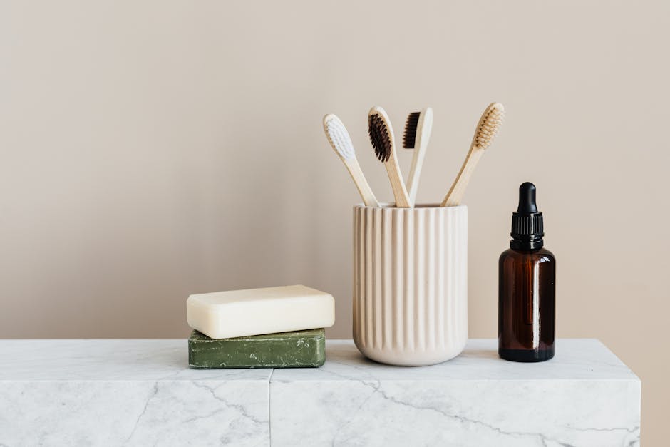
Set of natural toiletries on marble tabletop

The Role of Colors in Cosmetic Packaging Design

Colors are more than just a visual element; they communicate. In cosmetic packaging design, colors don’t just make your product look good; they speak to the consumer, conveying feelings, emotions, and brand identity. Think about it. Bright, bold colors often scream “Look at me!” pulling the customer’s eyes towards the shelf. These are perfect for products looking to make a loud statement or appeal to a younger demographic. On the other hand, softer, pastel colors might suggest gentleness, purity, or a natural vibe, aligning well with organic or sensitive skin products.

Now, let’s not forget black and white. These colors (or lack thereof) are all about sophistication and simplicity. Black screams premium, luxury. It’s for products that want to exude an aura of exclusivity. White, meanwhile, denotes cleanliness and simplicity, ideal for products promising purity and straightforward benefits.

Using color psychology can also play a crucial part in your design strategy. Red can evoke passion and energy, making it a strong choice for bold makeup items. Green often represents freshness and organic quality, fitting for eco-friendly beauty products. Blue can convey reliability and trust, which might suit skincare products aimed at a more conservative or broad audience.

Remember, the right color doesn’t just make your product pop; it’s a dialogue with potential buyers, telling them what your product stands for before they even read the label.

Typography and Font Choices for Cosmetic Packaging

Choosing the right typography and font for your cosmetic packaging is more than just picking what looks good. It’s about making a statement and ensuring your product screams “pick me!” on a crowded shelf. Think of typography as the style of communication and font as the voice of your brand. You want it to be clear, inviting, and reflective of your brand’s persona. Keep it simple but significant. A clean and readable font can often convey sophistication and elegance, while bold, unique fonts can shout innovation and fun. Remember, consistency is key. If your brand is all about luxury, opt for sleek, classy fonts like Serif types. For more earthy, organic products, perhaps a more natural, handwritten font would resonate. Whatever you choose, make sure it’s legible even from a distance and complements the overall design without overpowering the other elements. This simple choice can significantly impact making your cosmetic product the star of the shelf.

Material Matters: Selecting the Right Packaging Material

Choosing the right packaging material is not just about what holds your product; it’s about making a statement on the shelf. Think about it. If your product is eco-friendly, you’ll want materials that speak that truth, like recycled paper or biodegradable plastics. The material you choose tells your customer about the value of your product before they even try it. For a luxury item, think sleek metals or high-quality glass. These materials scream premium. But, remember, the material impacts the cost. More luxurious materials tend to hike up the price. Yet, they could be what sets your product apart in a crowded market. It’s all about balance. If you’re aiming for mass appeal, consider cost-effective yet durable options like plastic or thick paper. They’re easy on your budget and still give you a canvas for creative designs. Plus, they’re versatile. You can mold plastic into any shape, and with paper, the printing possibilities are endless. Bottom line, your choice of material can make or break your product’s success on the shelf. Think about your brand’s message, your target audience, and your budget. With these in mind, you’ll pick a material that not only protects your product but also presents it in the best possible light.

Practicality vs. Aesthetics: Striking the Right Balance

In the world of cosmetic packaging, finding the perfect balance between practicality and aesthetics is everything. You want your product to catch the eye but also be user-friendly. Let’s get straight to the point. Packages that look good but are hard to use or store will frustrate your customers. On the flip side, too practical can mean boring on the shelf. Your goal? A package that both pops visually and feels right in the hands of your consumer. Start with the material. It should feel premium to the touch yet be durable enough to protect the product. Consider the size and shape too. Unique shapes can attract attention, but remember, it needs to fit in makeup bags or bathroom cabinets comfortably. The design and colors are your chance to shout “look at me” without saying a word. But, keep it true to your brand and easy to identify. Lastly, think about the opening mechanism. It should be easy to use, no one wants to fight with a bottle first thing in the morning. By weighing practicality equally with aesthetics, you’re on your path to packaging that stands out for all the right reasons.

Innovative Packaging Shapes and Structures

In the crowded world of retail, packaging shapes and structures can be game changers. Think outside the box—literally. Traditional shapes are everywhere, but your product can grab more attention with something unique. Consider how brands like Apple make their packaging an experience. It’s not just about holding the product; it’s about creating an unforgettable unboxing moment. So, what can you do? First off, think about ergonomics. Packaging that’s easy to hold, open, and use will likely stay in consumers’ hands longer. Next up, materials matter. Eco-friendly options not only appeal to environmentally conscious consumers but also offer innovative design possibilities. How about a seed-infused package that grows into plants? Cool, right? Then, there’s the world of 3D printing, allowing for shapes and structures that were once considered impossible. Imagine packaging that interlocks, transforms, or even changes shape with temperature. Lastly, collaboration can bring fresh ideas. Work with artists or designers outside your usual sphere to push the envelope on what’s possible with packaging. Remember, standout packaging can turn a simple shelf browsing into a product purchase. So go bold, be different, and let your packaging tell a story that no one can ignore.

Eco-Friendly Packaging: A Growing Trend

In today’s market, eco-friendly packaging isn’t just a nice-to-have, it’s a must. More shoppers are looking for products that are kind to the planet, which means the packaging your cosmetic line uses can make a big difference in whether someone picks it off the shelf. Here’s the deal, using materials that are recyclable, biodegradable, or made from renewable resources can shout loud and clear that your brand cares about the environment. And it’s not just about the material itself. Think about minimalism. Less is often more. Reducing packaging size and avoiding unnecessary wrappers can also show customers that your brand takes sustainability seriously. While it might seem like a small thing, showing that your brand is committed to eco-friendly practices can set you apart from the competition and attract a base of loyal, environmentally conscious consumers. Remember, going green isn’t only good for the Earth—it’s great for business too.

The Psychology of Packaging: What Appeals to Consumers

People judge quickly. Studies show, in a store, you’ve got about 7 seconds to grab a consumer’s attention with your packaging. That’s where psychology sneaks in. Colors, shapes, and textures talk in silent words to the shopper. Bright colors like red and yellow can trigger feelings of excitement or warmth, making someone stop and look. Cooler tones like blue and green, though, say “calm” and “trust”, fitting for health products. It’s not just color. How a product feels in hand can sway a decision too. A smooth, heavy package might whisper “luxury” whereas a rough, light package might not scream “quality”. Imagine standing in an aisle. Your eye will likely land on a product that looks different if it balances well with its surroundings yet stands out. Yes, standing out is key but remember, too loud and you might scare them off. It’s a delicate dance of attention and affection. So, think. What does your product say without saying a word?

Case Studies: Successful Cosmetic Packaging Designs

When talking about making a product shine on the shelf, several cosmetic brands have nailed it. Let’s dive into some case studies of successful cosmetic packaging designs that have captured consumer attention and boosted sales. Glossier is first on our list. They went for a minimalistic approach with a lot of white space, pink accents, and simple typography. This not only made their products Instagram worthy but also communicated a clear, clean, and modern brand identity. Then, there’s Fenty Beauty by Rihanna. Fenty focused on inclusivity, not just in their product range but also in their packaging. Using nude tones that matched their diverse foundation shades, they created packaging that spoke directly to a wide array of customers. Lastly, Aesop, known for its premium skincare, uses medicinal-like amber bottles with black and white labels giving it a sophisticated apothecary look. This design communicates the brand’s commitment to quality and natural ingredients. These brands show how understanding your brand identity and target market can lead to packaging that not only stands out on the shelf but becomes iconic.

Final Tips: Do’s and Don’ts in Cosmetic Packaging Design

When designing cosmetic packaging, remember, it’s all about catching the customer’s eye while staying true to your brand. Here’s a simple guide to keep your product shining on the shelves. Do make sure your packaging reflects the essence of your product. If it’s organic, emphasize green and natural elements. If it’s luxury, aim for sleek and elegant. Don’t overcrowd the package with too much information. Stick to the essentials: what it is, what it does, and why it’s special. Do keep your font readable. Your brand name and key features should jump off the package, not hide in fancy, indecipherable lettering. Don’t ignore your competition. Understand what they do well and find a unique angle for your product. Finally, do test your packaging. What looks good on a design screen might not pop on the shelf. Checking your packaging in a real-world setting gives you the best shot at standing out. Stick to these do’s and don’ts to ensure your cosmetic product doesn’t just blend in but commands attention.

Read More
image 1
image 1

Enhancing Bakery Shelf Life: The Science Behind Effective Packaging Solutions

Introduction to Bakery Packaging Solutions

The goal of bakery packaging isn’t just to look attractive on the shelves; it’s crucial for keeping baked goods fresh, safe, and with an extended shelf life. Let’s dive into the world of bakery packaging solutions. This packaging ranges from the simple plastic wraps that encase your morning bagel to the intricate boxes safeguarding that decadent cake for your celebration. These solutions have one main job: to protect the bakery items from external factors like air, moisture, and sometimes even light, which can speed up the spoilage process. Whether it’s bread, cookies, or cakes, the right packaging can make a world of difference. It’s not just about keeping the air out; modern packaging techniques also focus on maintaining the right humidity and temperature conditions, ensuring that your favorite treats stay as fresh as the moment they were made. Through innovative materials and designs, bakery packaging solutions strive to deliver the perfect blend of practicality and presentation.

Woman in Red Checkered Plaid Button Up Shirt and White Apron Holding Black Smartphone

The Importance of Shelf Life in the Bakery Industry

Shelf life is a deal maker or breaker in the bakery industry. Get it right, and your baked goods fly off the shelves, winning repeat customers. Get it wrong, and you’re faced with wasted products and lost profits. Why? Because freshness equals quality in the minds of customers. Your croissants, cookies, and cakes need to reach consumers tasting as if they’ve just come out of the oven, even if they’re days old. This isn’t just about keeping things edible. It’s about maintaining taste, texture, and appearance. Extend the shelf life effectively, and you’re not just saving money by reducing waste. You’re building a brand people trust for quality. Simple as that.

Materials Used in Effective Bakery Packaging

When it comes to bakery packaging, not all materials are created equal. The goal is simple: keep baked goods fresh and safe from the moment they are wrapped until they reach the consumer. Key players in this game include plastic, paper, and aluminum foil. Plastic is a favorite for its ability to seal in moisture, which is crucial for keeping bakery items soft and preventing staleness. It’s versatile, too, allowing for a range of designs and sizes suitable for everything from bread to cookies. Paper, on the other hand, is celebrated for its eco-friendliness. It’s best for items that don’t need to be kept moist, like crusty bread and pastries. Paper packaging lets these items breathe, avoiding the sogginess that plastic can sometimes cause. Aluminum foil stands out for its ability to block out light and air, protecting delicate flavors and ensuring products like cakes and pies stay delicious. Each material has its stronghold in the packaging world, chosen carefully to match the bakery item it’s meant to protect. The choice between them hinges on balancing freshness, sustainability, and the specific needs of each baked good.

The Role of Oxygen and Moisture Barrier Packaging

When it comes to keeping bakery goods fresh, blocking out oxygen and moisture is key. Why? Because oxygen and moisture are the main reasons bakery items go stale or moldy. Think of oxygen and moisture as the enemies of freshness. To fight these enemies, companies use special packaging called oxygen and moisture barrier packaging. This type of packaging acts like a shield, keeping the bad guys out and locking goodness in.

Here’s how it works: Oxygen barrier packaging stops oxygen from getting in, which slows down the oxidation process. Oxidation is a fancy word for when oxygen starts messing with the food’s flavor, color, and texture. On the other hand, moisture barrier packaging keeps the product dry, preventing the growth of mold and bacteria, which love damp environments.

So, when you see bakery items on the shelf that seem to last forever, it’s often because they’re packed in this superhero packaging. The result? Your favorite bread, cookies, and pastries stay fresh and tasty for longer. That means less food waste, which is good for your wallet and the planet.

Innovative Technologies in Bakery Packaging

Bakeries now have better ways to keep bread and pastries fresh longer, thanks to new tech in packaging. Active packaging and intelligent packaging are game changers. Active packaging works by taking out bad stuff like moisture or oxygen from the package. This means your favorite loaf can stay fresh and yummy for longer. On the other hand, intelligent packaging talks to you. Well, not literally, but it can tell you when your food is about to go bad or if it’s still good to eat. This is super cool because it uses things like QR codes or sensors. But remember, the goal is to keep our food fresh and reduce waste, not to make packaging complicated. So, while these techs are fancy, they’re really all about keeping things tasty and less wasty.

Packaging Design Considerations for Extended Shelf Life

In expanding the shelf life of bakery products, packaging isn’t just about looks; it’s a science. The right packaging design plays a critical role. First, it’s about the material. Materials like polyethylene and PET protect against moisture and air—two big enemies of freshness. Next up, consider the seal. Airtight packaging keeps out oxygen and prevents staleness. Also, think about the shape and size. It should fit the product snugly, reducing air exposure. Plus, packaging that reduces light exposure can prevent fats from going rancid. Lastly, some packages include special features like oxygen absorbers or moisture regulators to help products stay fresh longer. So, while the taste first attracts consumers, smart packaging ensures that bakery goods stay delicious longer.

The Benefits of Biodegradable and Sustainable Packaging Options

Switching to biodegradable and sustainable packaging is more than just following a trend; it’s about making a lasting impact. Firstly, these eco-friendly options help cut down on waste. Traditional plastic packaging can take centuries to decompose, while biodegradable materials break down much quicker, turning into compost that enriches soil rather than polluting it. This means fewer piles of garbage in our landfills and oceans. Secondly, using sustainable packaging signals to your customers that your bakery cares about the environment. Nowadays, people want to support businesses that are mindful of their ecological footprint. This could lead to increased customer loyalty and even attract new patrons who value sustainability. Lastly, sustainable packaging often comes from renewable resources, which means they are constantly replenished. This reduces the strain on our planet’s finite resources and ensures that we can keep producing packaging materials without depleting our natural assets. In short, eco-friendly packaging is good for the earth, appealing to customers, and ensures we’re not robbing future generations of vital resources.

Case Studies: Successful Shelf Life Extension Examples

Many bakeries have turned to innovative packaging solutions to extend their products’ shelf life. One notable example is the use of modified atmosphere packaging (MAP). This technique adjusts the atmosphere surrounding the product within the package, significantly slowing down the growth of bacteria and mold. A bakery in France saw their bread’s shelf life jump from 2 days to 10 days by implementing MAP, dramatically reducing waste and increasing customer satisfaction. Similarly, vacuum packaging has gained traction. A confectionery in Japan experimented with vacuum-sealed packaging for their popular cakes, extending freshness from a mere 3 days to an impressive 15 days. The seal locks out air and moisture, two main culprits of spoilage. These examples highlight not just the possibility of prolonging shelf life, but also the potential for bakeries to enhance product quality, reduce waste, and ultimately, boost sales.

Regulatory and Safety Standards in Bakery Packaging

When it comes to bakery packaging, safety and following rules are top priorities. Here’s the deal: the government has strict guidelines to ensure food is safe to eat. This means bakery packaging must not only keep your bread or cookies fresh but also be safe and not harmful to our health. For starters, packaging materials should be free from toxic substances. This is crucial because anything harmful in the packaging can move into the food. Also, the packaging design must protect food from getting dirty or spoiled. It’s not just about keeping bugs out; it’s about making sure your food doesn’t get contaminated by bacteria or other harmful agents. Plus, labels must be truthful and informative, giving you clear info about what you’re eating. So, whether it’s a loaf of bread or a pack of cookies, the packaging plays a big role in making sure you enjoy fresh, safe, and delicious bakery items.

Conclusion: The Future of Bakery Packaging for Enhanced Shelf Life

The future of bakery packaging is bright and all about merging innovation with sustainability. As we’ve explored, the right packaging can significantly extend the shelf life of bakery goods, keeping them fresh and delicious for longer. It’s not just about creating a barrier against moisture and oxygen anymore. The focus is now on using materials that are eco-friendly and still provide the needed protection. Expect to see more biodegradable and compostable packaging options that do not compromise on quality. Advanced technology, like smart packaging that can interact with consumers and provide information on freshness, is also on the rise. This is where we’re headed – packaging that’s good for both the products and the planet. Remember, the key is to balance the shelf life extension with environmental impact. As technology advances, so too will our ability to maintain freshness and minimize waste, ensuring that the future of bakery packaging is as promising as it is sustainable.

Read More