

Blog

The Evolution of Cosmetic Packaging: From Shelf Appeal to Sustainability
Cosmetic packaging has always had to protect the product inside. What has changed is everything else brands now expect packaging to do.
Today, packaging is part of the product experience. It helps communicate brand identity, support usability, provide information, stand out on the shelf, and increasingly meet sustainability and regulatory goals. For beauty and personal-care brands, that means packaging decisions now involve much more than choosing a container that looks good.
The evolution of cosmetic packaging is moving toward a more connected approach, where aesthetics, performance, materials, refillability, recyclability, production requirements, and Extended Producer Responsibility, or EPR, all influence the final design.
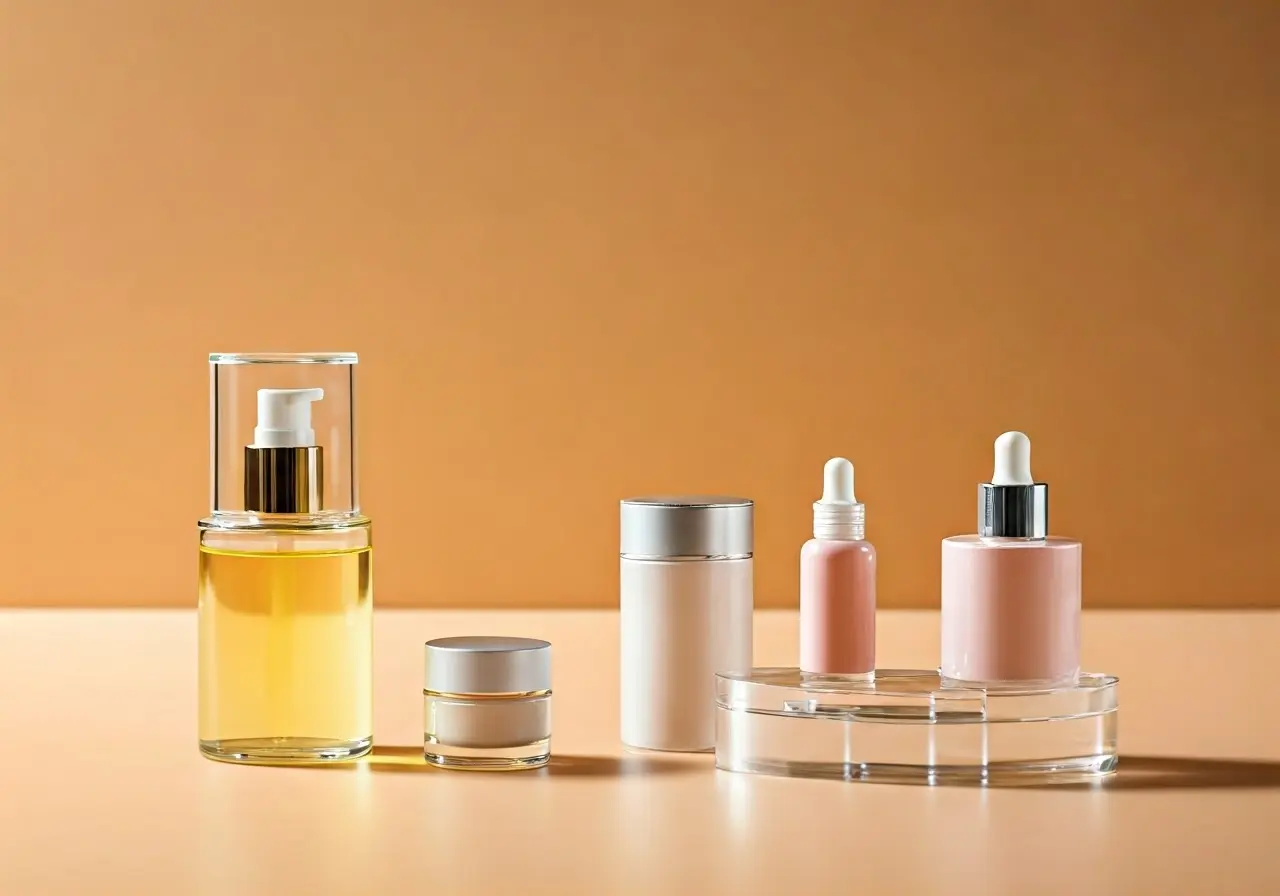
Cosmetic Packaging Started With One Job: Protect the Product
Early cosmetic packaging was primarily functional. Glass jars, tins, bottles, and other simple containers were selected to protect formulas, reduce contamination, and make products easier to store and use.
As the beauty industry expanded, packaging began taking on a second role. It became part of how a product communicated value. Containers, labels, color, typography, and decoration helped brands distinguish one moisturizer, fragrance, serum, or personal-care product from another.
That shift laid the foundation for modern cosmetic packaging, where function and brand experience are expected to work together.
Packaging Became Part of the Brand Experience
In a crowded beauty category, consumers often encounter the package before they know much about the formula inside. The shape of the container, the label material, the finish, the color palette, and even the way the package feels in the hand can influence how the product is perceived.
Modern printing and decorating technologies give brands far more options than basic ink on paper. Metallic finishes, tactile effects, embossing, specialty coatings, clear films, and other decorative techniques can help communicate everything from clinical precision to luxury or natural positioning.
At the same time, customization has become easier to support. Brands may need different artwork across product lines, seasonal versions, limited editions, or multiple SKUs without losing a consistent visual identity.
Technology Expanded What Cosmetic Packaging Could Do
Packaging is no longer limited to protecting a product and displaying a logo. It can also carry more information, connect a physical product to digital content, and support tracking or operational requirements.
QR codes and 2D barcodes can connect consumers to instructions, ingredient details, authenticity information, promotions, or brand experiences. Extended-content labels can provide additional room when required information exceeds the available package space. Digital printing can make shorter runs, versioning, and customization more practical for applicable projects.
These capabilities have changed the role of the package from a static container into an increasingly functional part of the product and brand experience.
Sustainability Changed the Packaging Conversation
For years, cosmetic packaging sustainability was often discussed in simple terms: use less plastic, switch to a material that appears more environmentally friendly, or add recycled content where possible.
Today, the conversation is more complicated and more useful.
A package should be evaluated as a complete system. The container, label, sleeve, closure, secondary packaging, refill format, and other components can all affect material use and end-of-life outcomes. A lightweight package may reduce material use, but it still needs to protect the formula. A recyclable container may lose some of that advantage if other components interfere with the recycling stream. A refill format may reduce repeated use of a primary package, but only if the full system performs as intended.
That is why sustainable cosmetic packaging increasingly requires a balance of product protection, material efficiency, recyclability, refillability, consumer use, production compatibility, and available recovery infrastructure.
View our Sustainability | Renew™ Sustainable Packaging page for more information.
Recyclable and Refillable Formats Are Reshaping Cosmetic Packaging
One of the clearest changes in beauty packaging is the growing interest in systems designed to reduce the amount of primary packaging a consumer replaces each time they purchase a product.
Refillable packaging can take several forms. A durable primary container may be designed for repeat use while the replacement product is supplied in a lighter refill format. Some brands are also evaluating flexible refill pouches with fitments or other multi-use formats where the product and filling requirements make them appropriate.
Recyclable packaging is also becoming a more important design consideration. But recyclability should not be treated as a single material claim. The complete construction, including labels, adhesives, sleeves, closures, and other components, can influence whether the finished package works well within a recycling stream.
For brands exploring refillable or recyclable formats, the best solution depends on the product, package performance, available materials, consumer use, and production requirements.
Fortis can support relevant printed packaging components and work with customers as they evaluate broader packaging systems. Some components, such as certain containers or fitments, may be supplied through partner relationships rather than produced directly by Fortis.
EPR Is Becoming Part of Cosmetic Packaging Design
Extended Producer Responsibility is adding another layer to packaging decisions.
EPR programs are designed to shift more responsibility for packaging waste to the companies that place packaging into the market. The exact requirements vary by jurisdiction, but they can influence how brands think about packaging weight, material type, recyclability, reporting, and fees.
That means EPR is becoming something packaging teams may need to consider earlier in the design process.
A package that performs beautifully on the shelf may still create challenges if its material choices increase complexity at end of life. Likewise, a redesign intended to improve recyclability or reduce packaging weight still needs to protect the product, run efficiently through production, and deliver the right consumer experience.
For cosmetic brands, EPR adds another reason to evaluate the full packaging system instead of choosing individual components in isolation.
Flexible Packaging Is Expanding the Beauty Packaging Toolkit
Beauty and personal-care packaging is also moving beyond traditional jars, bottles, tubes, and cartons.
Depending on the product, flexible packaging formats can support samples, travel sizes, refills, concentrated products, or single-use applications. Pouches may provide a refill or multi-use format. Sachets can support samples or trial sizes. Stickpacks can be appropriate for certain powders, gels, liquids, or other single-serving products.
Flexible packaging is not the right answer for every cosmetic product. Compatibility with the formula, barrier requirements, filling method, seal performance, shelf life, and consumer use all need to be evaluated before selecting the format.
Shrink Sleeves and Labels Continue to Evolve Too
The evolution of cosmetic packaging is not limited to the container.
Labels and shrink sleeves can play an important role in branding, product information, functionality, and sustainability goals. A pressure-sensitive label can use different materials, finishes, and functional features to support both shelf appeal and package performance. Shrink sleeves can provide broad graphic coverage while also becoming part of broader conversations around container design and recyclability.
The most effective approach is to evaluate the container and decoration together. Material compatibility, adhesives, inks, sleeve films, coverage, and end-of-life goals may all affect the final packaging strategy.
The Future of Cosmetic Packaging Is About the Whole System
The next stage of cosmetic packaging is not simply about making packages more attractive or replacing one material with another.
Brands are increasingly balancing several priorities at the same time:
- Product protection and shelf life
- Shelf appeal and brand consistency
- Consumer convenience
- Recyclability and refillability
- Material reduction
- EPR requirements
- Production-line compatibility
- Cost and supply-chain realities
- Digital and smart-packaging functionality
Those priorities can sometimes compete with one another. The lightest material may not provide the right barrier. A beautiful finish may need to be reconsidered if it affects recyclability. A refill concept may require new filling equipment or partner capabilities.
That makes packaging development more collaborative than ever. Rather than treating the label, flexible package, sleeve, carton, or container as separate decisions, brands can benefit from evaluating how all of the components work together.
Questions Brands Should Ask When Updating Cosmetic Packaging
When evaluating a new cosmetic package or refreshing an existing one, it helps to start with the complete product and packaging system.
Consider questions such as:
- Does the package protect the formula throughout its intended shelf life?
- Can materials or components be reduced without compromising performance?
- Is the package recyclable in the markets where it will be sold?
- Could a refill system reduce repeated use of primary packaging?
- How could EPR requirements affect the selected materials or format?
- Do the label, sleeve, adhesive, and decoration support the package’s end-of-life goals?
- Will the packaging run efficiently on the intended production equipment?
- Does the package give the brand enough flexibility for future SKUs, sizes, or product extensions?
The answers will differ from product to product. That is why cosmetic packaging innovation increasingly starts with the application, not with a single material or format.
Cosmetic Packaging FAQs
What are the biggest trends in cosmetic packaging today?
Some of the most important cosmetic packaging trends include recyclable and refillable systems, reduced material use, smart packaging, personalization, flexible formats, improved consumer usability, and greater attention to EPR requirements. The best approach depends on the product, market, and packaging system.
What is sustainable cosmetic packaging?
Sustainable cosmetic packaging considers the full package rather than one material in isolation. Important factors can include material use, product protection, recyclability, refillability, package weight, production efficiency, and available end-of-life infrastructure.
Is refillable cosmetic packaging more sustainable?
Refill systems can reduce repeated use of some primary-packaging components, but the overall benefit depends on the complete system. The materials used in the refill, how often the primary package is reused, shipping, product protection, and consumer behavior all matter.
How does EPR affect cosmetic packaging?
EPR programs can make producers financially responsible for packaging placed into the market. Depending on the jurisdiction, packaging weight, material type, recyclability, and other factors may influence reporting requirements or fees. Brands should evaluate current requirements in the markets where products are sold.
Can cosmetic products use flexible packaging?
Yes, some cosmetic and personal-care products can use flexible packaging such as pouches, sachets, or stickpacks. Suitability depends on the formula, barrier requirements, filling process, seal performance, shelf life, and intended consumer use.
How can brands modernize cosmetic packaging without losing shelf appeal?
Brands do not have to choose between performance and appearance. Printing, labels, sleeves, tactile finishes, color, structure, and material selection can all be evaluated together so the package supports brand positioning while meeting functional and sustainability requirements.
Building the Next Generation of Cosmetic Packaging
Cosmetic packaging has evolved far beyond basic containment. Today, successful packaging needs to protect the formula, support the brand, work for the consumer, perform in production, and increasingly account for recyclability, refillability, and EPR.
Fortis Solutions Group works with brands across labels, flexible packaging, shrink sleeves, sustainable packaging, and other printed packaging formats to help evaluate solutions around product and production needs.
Contact Fortis About Your Cosmetic Packaging

Enhancing Your Product’s Appeal with High-End Luxury Packaging Solutions
In a competitive market, the appearance and presentation of your product can make a significant difference. High-end luxury packaging is not just about protection; it’s about creating an experience that resonates with your customers. We’ll explore how investing in luxury packaging can elevate your brand’s appeal and ensure your product stands out on the shelf.
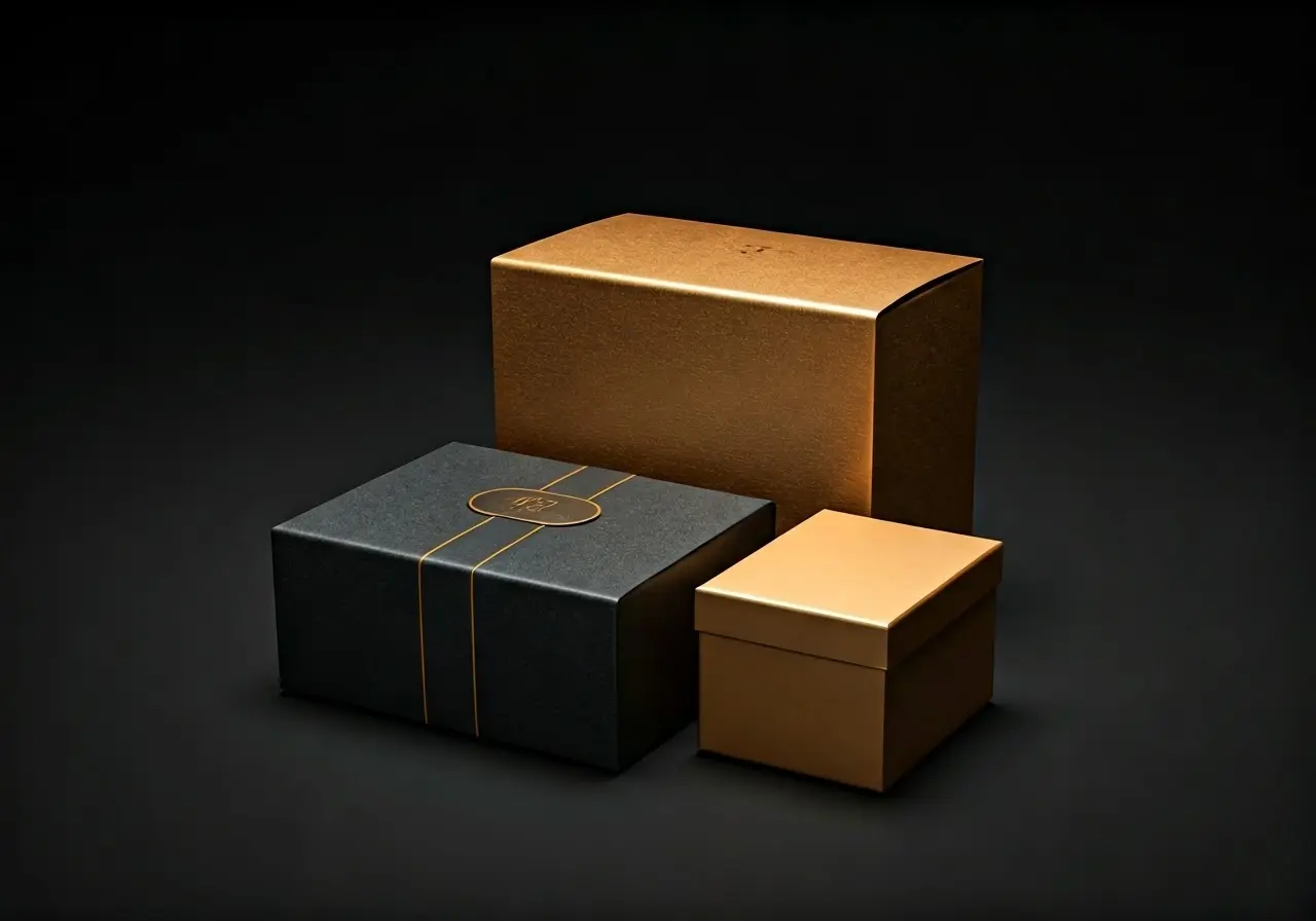
Why Luxury Packaging Matters
Luxury packaging plays a critical role in creating a first impression. It’s often the first interaction a potential customer has with your product, and it sets the tone for their entire experience. High-end packaging conveys quality, care, and attention to detail. It suggests that what’s inside is just as luxurious as the outside, encouraging customers to perceive your product as premium.
Think about the last time you received a beautifully packaged gift. The unboxing experience probably added to your anticipation and excitement, didn’t it? That’s the magic of luxury packaging. It transforms a simple purchase into a memorable event. The tactile and visual appeal of the package can invoke positive emotions and create a lasting connection with your customers. This is especially important in today’s market, where consumers are looking for more than just products; they crave experiences.
Moreover, luxury packaging can enhance brand loyalty. When customers associate your brand with high-quality packaging, they are more likely to make repeat purchases. The perceived value of a well-packaged product can justify a higher price point, improving your brand’s profitability. In essence, your packaging can turn a one-time buyer into a loyal advocate who appreciates and values your brand’s commitment to excellence.
Additionally, luxury packaging serves as a powerful marketing tool. Eye-catching packages naturally attract attention on crowded retail shelves, prompting curiosity and interest. In the age of social media, aesthetically pleasing packaging can also lead to organic word-of-mouth marketing. A striking package design is more likely to be shared on platforms like Instagram, extending your brand’s reach far beyond traditional advertising methods.
Types of High-End Packaging Materials
From sleek glass to textured cardstock, the materials used in luxury packaging can vary widely. Selecting the right material is crucial as it should align with your brand’s identity and the product’s nature. Common luxurious materials include embossed papers, silk ribbons, metallic foils, and high-quality plastics, each offering its unique aesthetic and tactile experience.
Each type of material brings a different level of sophistication to your packaging. For instance, glass packaging denotes purity and timelessness, often used for perfumes and high-end cosmetics. Textured cardstock can give a bespoke, artisanal feel, making it perfect for custom products or limited editions. Meanwhile, metallic foils add a touch of glamour and shine, making the package stand out immediately.
Leather and wood can also be employed for a more rustic yet luxurious impression. These materials are particularly effective for products that want to convey heritage and craftsmanship. For instance, a fine whiskey presented in a wooden box with leather accents can signal quality and tradition, enhancing the overall product experience.
Design Elements to Consider
The design of luxury packaging goes beyond just choosing materials. It involves careful consideration of colors, typography, and structural design. Minimalist designs often convey elegance, while intricate patterns can suggest opulence. Personalization options such as monograms and custom prints can further enhance the luxury feel. Your design choices should align with your brand message and target audience preferences.
Consider the role of color in packaging design. Subtle, muted tones can evoke a sense of sophistication and calm, while bold, vibrant colors can make a statement and attract attention. Typography also plays a significant role; elegant fonts can elevate the entire look of the packaging, making it appear more refined.
Spatial design is another critical aspect. How the product sits within the packaging can also affect the unboxing experience. Having compartments or layers within the package can make the unwrapping process more engaging and delightful. It’s the little details that often leave the biggest impressions, so consider every element thoroughly.
Sustainability in Luxury Packaging
With growing consumer awareness, incorporating sustainability into luxury packaging is both a challenge and an opportunity. Sustainable materials and eco-friendly practices do not have to compromise the luxurious feel. Recycled materials, biodegradable options, and eco-conscious design practices can help your brand maintain its luxury appeal while also being environmentally responsible.
The challenge lies in finding the balance between sustainability and luxury. Fortunately, advancements in material science and design innovation have made it possible to create beautiful, high-end packages that are also eco-friendly. For example, bamboo or other fast-growing, renewable resources can be used to create elegant packaging solutions.
Moreover, communicating your commitment to sustainability can further enhance your brand’s appeal. Consumers today are more likely to support brands that take responsibility for their environmental impact. Highlighting your eco-friendly practices on the packaging or in promotional materials can attract a new, conscientious customer base.
Case Studies: Brands Excelling in Luxury Packaging
Examining brands that have successfully implemented luxury packaging can provide inspiration and insights. For instance, Apple’s packaging is renowned for its sleek design and premium feel, while high-end fashion brands like Chanel use classic, timeless packaging that reflects their brand values. These case studies highlight how thoughtful packaging can elevate the customer experience and reinforce brand identity.
Tiffany & Co. serves as another excellent example. Known for their iconic blue boxes, the company has mastered the art of luxury packaging. The moment you see the distinct Tiffany blue, you recognize the brand instantly. This consistency and recognizability make their packaging a crucial part of their brand identity.
Another noteworthy example is Godiva Chocolatier. They use luxurious materials like silk ribbons and gold embossing to package their chocolates, making each box a gift-worthy item. This kind of packaging elevates the product, transforming it from simple sweets into a symbol of indulgence and luxury.
Elevate Your Brand with Luxury Packaging
Investing in high-end luxury packaging solutions is more than just a trend; it’s a strategic move to enhance your product’s appeal, resonate with your customers, and elevate your brand’s image. By understanding the importance and various aspects of luxury packaging, you can make informed decisions that contribute to your product’s success and your brand’s growth.

The Evolution of Cosmetic Packaging in the Eco-Friendly Era
Cosmetic packaging has undergone a significant transformation in recent years, driven by a rising awareness of environmental issues and the demand for sustainable practices. This shift towards eco-friendly packaging is changing the face of the beauty industry. Let’s dive into how cosmetic packaging has evolved in this eco-friendly era.
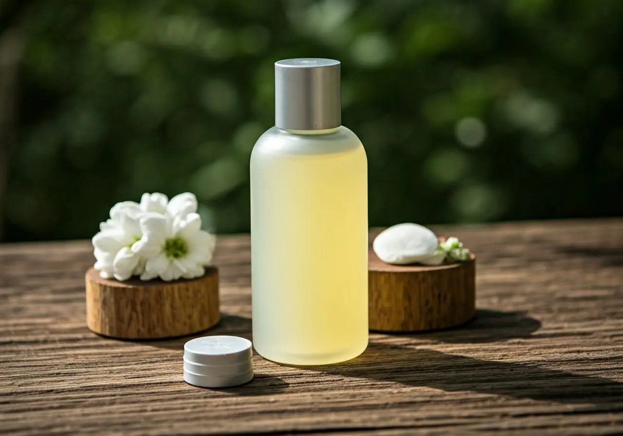
The Rise of Environmental Awareness
Environmental awareness has significantly influenced consumer behaviors and industry practices. More people are recognizing the impact of their purchasing decisions on the planet, and this awareness is driving demand for sustainable products, including cosmetics.
In the past, the primary focus was on the aesthetic appeal and functionality of cosmetic packaging. However, with the growing concern over pollution and climate change, the narrative has shifted. Consumers now seek transparency from brands regarding their environmental practices and often prefer products that minimize ecological impact. This heightened awareness is not a fleeting trend but a profound shift that has redefined what consumers expect from the beauty industry.
As a result, brands are reevaluating their packaging strategies. They are investing in research to develop packaging that meets the new sustainability criteria without compromising the product’s integrity. This has led to partnerships with environmental organizations to align their goals and inspire trust among eco-conscious consumers. By doing so, companies are not only catering to consumer preferences but also contributing to positive global environmental changes.
Innovative Sustainable Materials
From biodegradable plastics to recycled materials, the range of sustainable options available today is impressive. Brands are experimenting with bamboo, glass, and even mushroom-based packaging to reduce environmental footprint.
Biodegradable plastics, derived from renewable resources like corn starch and sugarcane, are increasingly used in cosmetic packaging. These materials break down more easily, lessening their environmental burden. Glass, a timeless and infinitely recyclable material, has also seen a resurgence in use. Not only does glass provide a premium look and feel, but its recyclability makes it a favorite among environmentally conscious brands.
Interestingly, companies are exploring innovative alternatives like mushroom-based packaging, which uses mycelium—the root structure of mushrooms—to create a compostable material. This futuristic approach highlights the lengths to which brands are willing to go to achieve sustainability. Some brands are even turning to ocean plastic, collecting waste from oceans to create recycled packaging. This not only helps clean our planet’s waters but also provides a powerful story to connect with consumers.
Moreover, bamboo-based packaging has gained popularity for its rapid growth rate and minimal environmental impact. Bamboo requires little water and no pesticides, making it an eco-friendly alternative to traditional packaging materials. With numerous brands exploring these sustainable materials, it’s evident that innovation is at the heart of the industry’s transformation.
Designing for Reuse and Refill
Refillable and reusable packaging solutions are becoming more popular. Companies are offering products in containers designed for multiple uses, reducing waste and encouraging a circular economy.
One of the most significant developments in eco-friendly cosmetic packaging is the emphasis on design for reuse and refill. Traditional packaging often ends up in landfills after a single use, but innovative brands are changing that narrative. They are creating sophisticated, aesthetically pleasing containers that can be refilled multiple times. This approach not only helps in reducing waste but also fosters a deeper connection between consumers and their favorite brands.
For instance, some brands have introduced elegant refill stations at their retail outlets, allowing customers to replenish their products without generating additional waste. Others offer subscription models where refills are delivered directly to consumers, often in minimalist, eco-friendly packaging. By prioritizing reuse and refill, brands create less waste, save on production costs in the long run, and cultivate customer loyalty through sustainable practices.
Challenges in Implementing Eco-Friendly Packaging
Despite the advancements, there are hurdles to overcome, such as cost, availability of materials, and consumer perceptions. Achieving a balance between sustainability, functionality, and aesthetics is a key challenge for brands.
One of the biggest obstacles facing the industry is the higher cost associated with eco-friendly materials. Sustainable options, while better for the environment, are often more expensive to produce and source. This cost can be a deterrent for both businesses and consumers, especially in a market where price sensitivity is high. Additionally, ensuring the availability and consistency of these materials is a constant challenge.
Consumer perceptions also play a pivotal role. While many consumers are enthusiastic about eco-friendly packaging, there is still a sizeable segment that prioritizes convenience and aesthetics over sustainability. Companies must find innovative ways to educate and convince these consumers about the benefits of sustainable packaging without sacrificing the product’s appeal. Balancing functionality with environmental responsibility requires ongoing research and development efforts.
Another challenge lies in the regulatory landscape. Different regions have varying standards and regulations regarding packaging materials and recycling practices. Navigating this complex terrain requires companies to be meticulous and responsive, ensuring their packaging meets all relevant guidelines while remaining sustainable and practical.
The Role of Consumers in Driving Change
Consumers play a crucial role in pushing for more sustainable packaging. Their preferences and willingness to support eco-friendly brands can drive significant change in the industry, encouraging more companies to adopt sustainable practices.
Modern consumers have more power than ever before when it comes to shaping industry standards. By choosing to purchase products from brands that prioritize sustainability, consumers send a clear message about what they value. This consumer-driven demand compels companies to innovate and adopt greener practices. Social media and online platforms amplify this impact, enabling consumers to share their preferences and influence others.
Moreover, consumers are increasingly willing to participate in sustainability initiatives. Many are open to using refillable containers, buying in bulk, or supporting brands that offer take-back programs for packaging. This active participation not only reduces waste but also encourages brands to develop more eco-friendly solutions, knowing that there is a receptive and eager market for such products.
Education and awareness are pivotal. When consumers understand the environmental impact of their choices, they are more likely to opt for sustainable alternatives. Brands can play a crucial role in this regard by transparently communicating their sustainability efforts and highlighting the environmental benefits of their packaging choices. This creates a positive feedback loop where informed consumers drive brands to continually improve and adopt greener practices.
The Future of Cosmetic Packaging
The journey of cosmetic packaging towards a more sustainable future is promising and inspiring. As consumers become more eco-conscious, brands are taking significant steps to align their practices with these values. While challenges remain, the progress made thus far sets a positive trajectory for the future of the beauty industry.

9 Cute and Creative Bakery Packaging Designs That Will Captivate Your Customers
In the world of bakeries, where the aroma of freshly baked goods captivates the senses, how your products are packaged can be just as enticing. Let’s dive into the art of bakery packaging, exploring nine designs that are as delightful to look at as the treats they hold within. With creativity at the forefront, these packaging ideas will not only captivate your customers but also elevate the overall appeal of your delectable creations.
1. Eco-Chic: Sustainable and Stylish
In the era of environmental awareness, eco-friendly bakery packaging is not just a trend; it’s a statement. Using biodegradable materials or recyclable paper can convey your brand’s commitment to sustainability. Picture this: delightful pastries nestled in packaging made from plant-based materials, adorned with natural tones and subtle textures. It’s an approach that resonates with eco-conscious consumers, blending aesthetics with environmental responsibility seamlessly. Moreover, adding a small note about your packaging’s compostability can further emphasize your dedication to the planet.
Consider how these sustainable packages can also serve as a canvas for creativity. Using soy-based inks for printing can introduce vibrant designs without harming the environment. The fusion of innovative shapes, such as hexagonal cake boxes, with eco-conscious materials challenges the notion that sustainable packaging must forsake style for substance. Thus, through thoughtful design, bakery owners can craft an eco-chic packaging experience that captivates customers and cares for the planet alike.
2. Minimalist Magic: Less Is More
Minimalism in bakery packaging speaks volumes through simplicity. A clean, uncluttered look with a focus on typography can make your product the star of the show. Imagine a sleek cardboard box with a modern, sans-serif typeface detailing the contents within. Such minimalistic design not only highlights the product but also appeals to a consumer’s desire for elegance and simplicity. This approach to packaging invites customers to appreciate the beauty and craftsmanship of the baked goods themselves, relying on the power of less to convey more.
3. Vintage Vibes: A Nostalgic Touch
Tapping into nostalgia, vintage-themed bakery packaging evokes warmth and memories of yesteryears. By incorporating elements like lace patterns, classic typography, and muted color palettes, bakery owners can transport their customers to a bygone era. A cookie box resembling an old-fashioned tin or a cake box with sepia-toned illustrations can create a sense of nostalgia, making each purchase not just a transaction but an emotional experience. This romantic approach links the pleasure of enjoying baked goods with the sweet nostalgia of the past, making each bite a trip down memory lane.
4. Pop of Color: Bright and Bold
In a sea of brown and white packaging, a bright pop of color can make your bakery products stand out on the shelf. Vibrant colors and bold patterns grab attention and can become a hallmark of your brand identity. A colorful macaron box or a bold, geometric-patterned pastry bag not only houses the product but also communicates the joy and playfulness of indulging in your baked goods. It’s a visual feast that promises the same delight as the treats inside, making the packaging an integral part of the customer’s experience.
5. Whimsical Illustrations: Storytelling through Art
Whimsical illustrations on bakery packaging invite storytelling, adding depth and character to the simple act of buying baked goods. Whether it’s a fanciful scene of the ingredients coming together or an adorable depiction of the bakery itself, these illustrations turn the packaging into a canvas for creativity. Engaging visuals not only enchant the buyer but also foster a connection between them and the baked treats. Such artistic packaging becomes a keepsake, a memento of the delightful experience your bakery offers.
6. Crafty and Artisanal: The Handmade Appeal
Artisanal bakery packaging, with its handcrafted look, emphasizes the bespoke nature of the culinary creations it encloses. Using materials like stamped paper, twine, and wax seals can give packaging a handmade, rustic charm that resonates with the craftsmanship of artisanal baking. This style tells a story of tradition, of products made with care and skill, appealing to those who seek a more personal touch in what they consume. It’s a reminder of the human hands behind every loaf, pie, or pastry, connecting customers to the bakers’ dedication to quality and artistry.
7. Window Wonders: Peek Inside
Implementing a window feature in your bakery packaging offers a tempting preview of the treats inside, sparking immediate visual appeal. This transparent touch invites customers to feast with their eyes first, building anticipation for the sensory delights to come. It’s an honest showcase of your product, allowing the quality and freshness of the baked goods to speak for themselves. Whether it’s a cupcake box with a clear top or a bread bag with a petite peekaboo panel, windows in packaging combine functionality with an irresistible visual draw.
8. Seasonal Sensations: Celebrating the Holidays
Seasonal packaging transforms ordinary bakery goods into festive treats, celebrating the spirit of holidays through design. Custom packaging for Christmas, Easter, Valentine’s Day, or Halloween can turn baked goods into sought-after gifts. Imagine a Christmas cookie box adorned with snowflakes and reindeer, or a Valentine’s cake package with hearts and arrows. Seasonal packaging not only emboldens the festive cheer but also encourages customers to share the love (and deliciousness) with others. It’s a way for bakeries to participate in the joy of giving, creating special memories around their products.
9. Personalized Packages: A Unique Touch
Personalized bakery packaging adds an intimate layer to the customer experience, turning a simple purchase into a tailor-made treat. Whether it’s including the customer’s name, a special message, or even a customized design, this approach makes each piece feel exclusive and cherished. Such customization not only delights recipients but also strengthens their emotional connection to your brand. It transforms bakery items from mere consumables to thoughtful gestures of affection, embodying the personal touch that so many consumers desire.

Fortis Solutions Group Announces Carlos Tapias as CEO
VIRGINIA BEACH, VA, Sept. 3, 2024 — Fortis Solutions Group LLC (“Fortis”), a leading provider of high impact printed packaging solutions and a portfolio company of funds managed by Harvest Partners, LP, today announced the appointment of Carlos Tapias as its next Chief Executive Officer.
Mr. Tapias is a highly regarded packaging executive who has more than 20 years of experience with both US and international companies. Previously the Vice President and General Manager of Tekniplex’s North America Fresh Food business, Mr. Tapias spearheaded the integration of Grupo Phoenix, acquired in 2021, where he had served as CEO of its US operations. He began his career at Grupo Phoenix as a Sales Manager in 2001 and rose to become CEO of its Latin America operations. Mr. Tapias has a Bachelor of Science in engineering from the Colombia Naval Academy, a Bachelor of Science in industrial engineering from the University of Miami and an Executive Business Administration degree from the Universidad De La Sabana in Colombia.
After fourteen years as CEO of Fortis, John O. Wynne, Jr. will become Chairman of the Board of Directors as part of the planned transition and continue to lead the company’s merger and acquisition activities. “I am very appreciative of the wonderful team at Fortis,” said Mr. Wynne. “I never envisioned that we would grow from a single site with a single product line to a leading North American provider of packaging solutions. I would also like to thank Harvest Partners for their support with this transition during their investment. Carlos is an outstanding leader who will take Fortis to even greater heights, and I look forward to supporting the entire Fortis team in my new role.”
Mr. Tapias said, “I am honored and excited to join the Fortis team. This transition represents a pivotal moment for the company as we strive to deliver exceptional value to our customers and stakeholders, and to build the next chapter of our story together.”
Jim Mitchel, Partner at Harvest Partners commented, “We are thrilled to welcome Carlos to the Fortis team. His extensive experience and proven track record as a sales and operations leader in the packaging industry gives us great confidence in his ability to lead Fortis into the future.”
Fortis currently has over 1,300 employees across twenty manufacturing sites in the US and Canada.
For more information, or to contact a sales representative to learn more about how Fortis can make a difference for you, please call 1-844-FSG-LBLS or visit www.FortisSolutionsGroup.com.
About Fortis Solutions Group
At Fortis Solutions Group, we provide a differentiated approach giving our customers a powerful advantage in the marketplace through industry leading lead times, quality control, color management and solutions-oriented approaches. We deliver a breadth of product offerings utilizing our outstanding flexographic, letterpress, offset and digital printing capabilities. These offerings include pressure sensitive and shrink sleeve labels, multi-ply coupon and flexible packaging printing, extended booklet printing, pouches, folding cartons, label applicators and variable data printing. Headquartered in Virginia Beach, VA, the company also has manufacturing and sales offices in Catoosa, OK, Cordova, TN, Decatur, AL, Ellington, CT, Flowery Branch, GA, High Point, NC, Lewisville, TX, Marietta, GA, Merced, CA, Montgomery, IL, Napa, CA, Norfolk, VA, Novi, MI, Orem, UT, Paso Robles, CA, Santa Fe Springs, CA, Somersworth, NH, St-Hubert, Quebec, Canada, and West Chester, OH.

The Top 7 Trends in Beer Labels for 2023: What You Need to Know
As the craft beer industry continues to explode, so does the creativity behind beer labels. With 2023 on the horizon, breweries are pushing the envelope, blending art, technology, and sustainability in their label designs. This isn’t just about grabbing attention anymore; it’s about telling a story, delivering a message, and creating a unique experience. Let’s dive into the top trends in beer labels for 2023 that are setting the bar high.
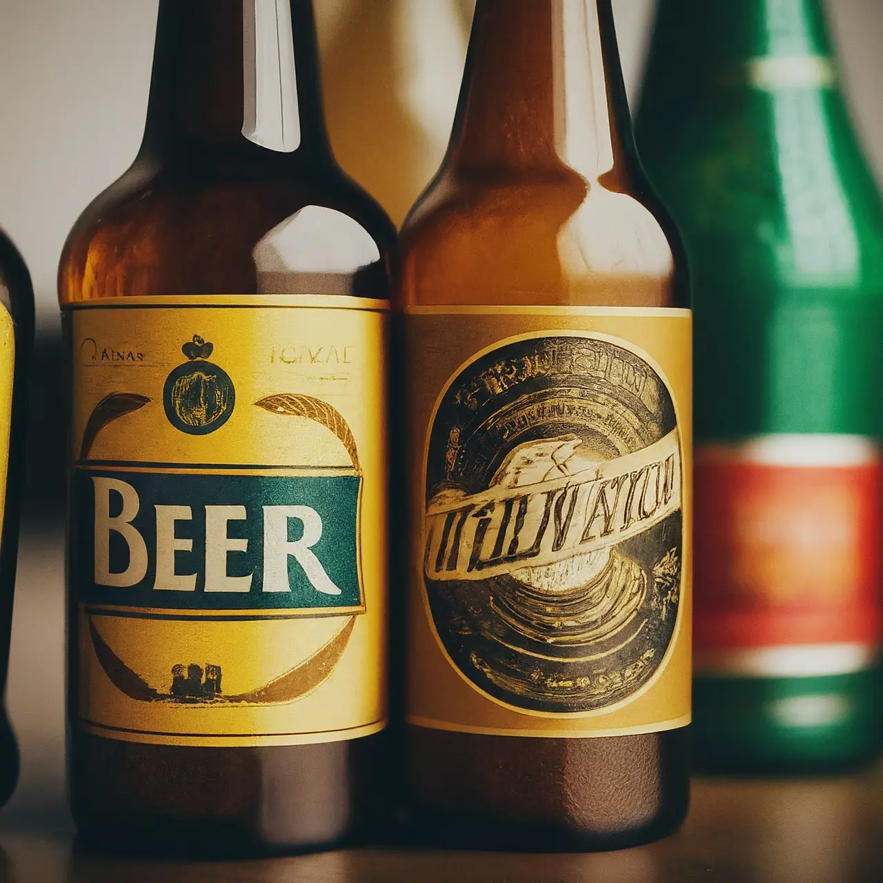
1. Eco-Friendly Goes Mainstream
In 2023, sustainability isn’t just a buzzword; it’s a vital component of beer label design. Breweries are increasingly opting for eco-friendly materials, including biodegradable labels and inks made from natural sources. This shift not only demonstrates a commitment to environmental stewardship but also appeals to the growing number of consumers prioritizing eco-conscious products. By incorporating these sustainable practices, breweries are not just making a statement but also contributing to a larger movement towards greener packaging solutions.
2. The Augmented Reality Experience
Augmented reality (AR) is revolutionizing the way we interact with beer labels. Imagine pointing your smartphone at a beer bottle and watching the label come to life, telling the brewery’s story or providing food pairing suggestions. This innovative approach marries technology with tradition, creating an engaging and informative experience for the consumer. Breweries are leveraging AR to stand out on crowded shelves and forge a deeper connection with their audience. As we move into 2023, expect to see more labels that aren’t just visually appealing but are gateways to immersive digital experiences.
3. Vintage and Retro Revival
There’s a nostalgic wave sweeping through the craft beer industry, with breweries drawing inspiration from vintage and retro designs. These labels, reminiscent of bygone eras, evoke a sense of nostalgia, comforting consumers with familiar aesthetics from the past. However, this trend isn’t just about looking back; it’s about bringing classic sensibilities into the modern age with a contemporary twist. By blending old-school charm with modern design techniques, breweries are creating labels that appeal to both longtime beer lovers and newcomers seeking a taste of history.
4. Bold and Minimalist Designs
Simplicity is making a bold statement in the beer label industry. Minimalist designs, characterized by clean lines, simple color palettes, and uncluttered layouts, are becoming increasingly popular. This trend speaks to the consumer’s desire for straightforwardness and authenticity, allowing the quality of the beer to shine without the distraction of overly complicated labels. A well-executed minimalist design can be eye-catching in its simplicity, proving that sometimes, less really is more.
5. Custom Typography and Hand-drawn Art
Personalization and authenticity are key themes in beer label design for 2023, with a growing number of breweries embracing custom typography and hand-drawn art. This approach lends a unique voice to the brand, showcasing the brewer’s creativity and passion. Whether it’s whimsical illustrations or elegant hand-lettering, these artistic elements tell a story and create a tangible connection between the brewer and the consumer. This trend underscores the craft beer industry’s commitment to individuality and artisanal quality.
6. The Use of Metallic and Holographic Elements
Beer labels are shining brighter than ever with the incorporation of metallic and holographic elements. These flashy accents catch the eye and add a luxe feel to the packaging, elevating the beer-drinking experience. Whether it’s a golden sheen highlighting the brewery’s logo or a holographic pattern that changes in the light, these details instill a sense of premium quality. As consumers seek out unique and Instagram-worthy products, expect to see more labels making use of these eye-catching finishes.
7. Interactive Labels
The trend towards interactive labels reflects the evolving relationship between brewers and their audiences. Beyond augmented reality, breweries are incorporating elements like QR codes and temperature-sensitive inks that change color when the beer is chilled to perfection. These interactive features add a playful element to beer labels, encouraging consumers to engage with the brand in innovative ways. As breweries look for new methods to captivate and connect with their audience, interactive labels represent a fusion of functionality and fun.