

Blog

12 Innovations in Label Applicators You Must Know
Label applicators have come a long way in recent years with advancements that are nothing short of revolutionary. Whether you’re in the packaging industry or just curious about the technological strides in label application, this blog is here to guide you through the most exciting innovations revolutionizing the field.
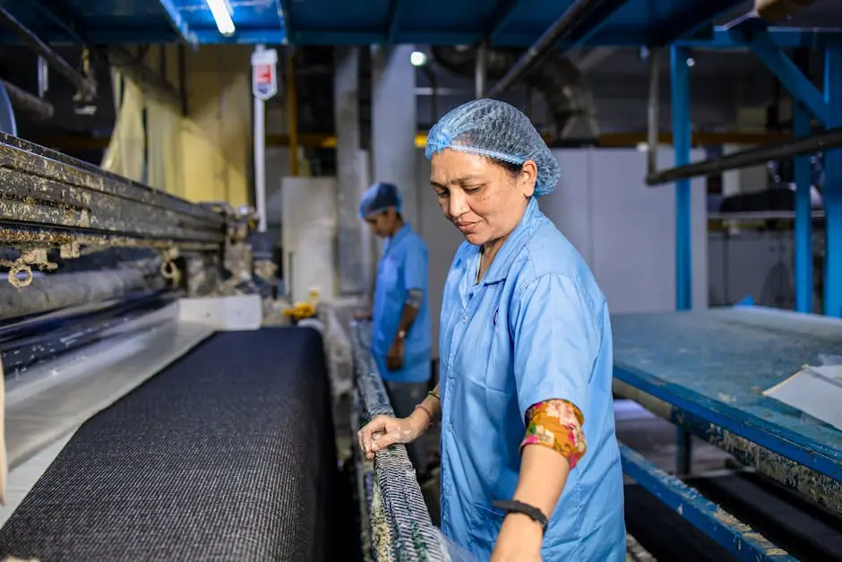
1. Enhanced Precision with Laser-guided Systems
Laser-guided systems have dramatically improved the precision with which labels can be applied. These systems utilize high-tech sensors that ensure labels are placed at exact positions on products, reducing errors that traditionally led to wastage. Such technology not only enhances the overall aesthetic of the package by maintaining uniform label placement but also aligns with production efficiency goals by minimizing the time spent on corrections. The ability to recalibrate with accuracy means that businesses can now more confidently maintain quality controls even with variations in product shapes and sizes.
Furthermore, the integration of laser guidance into label applicators represents a significant leap towards automation. By minimizing human intervention, these systems not only streamline the workflow but also reduce the potential for human error. This advancement is particularly valuable in high-speed production environments where even minor delays can affect overall productivity. In essence, laser-guided systems are not just about accuracy; they also symbolize the harmonious blend of speed and precision in modern manufacturing.
2. Eco-friendly Materials in Label Manufacturing
The demand for sustainable practices has become a driving force in label manufacturing. A notable trend has been the shift towards eco-friendly materials, which helps reduce the environmental impact of label production and disposal. These materials, often derived from renewable resources, are engineered to decompose more readily than traditional alternatives. As consumers become more environmentally conscious, businesses are responding by integrating these materials into their labeling processes, underscoring a commitment to sustainability without sacrificing quality.
Moreover, innovations in this space have ensured that eco-friendly labels meet the same durability standards as their conventional counterparts. They are resistant to wear and tear, providing the same level of protection and information delivery while promoting a greener footprint. As packaging regulations become stricter regarding sustainability, investing in eco-friendly labeling solutions is not just responsible but necessary for compliance and brand reputation.
3. Integration of AI for Intelligent Labeling
Artificial Intelligence (AI) is at the forefront of intelligent labeling, enabling unprecedented levels of customization and efficiency. With AI, label applicators can now adapt in real-time to changes in production dynamics by analyzing data streams to optimize application processes. This means smarter, adaptive systems that can predict and adjust to potential issues before they result in costly downtime, thereby ensuring smooth operations. The potential for AI to learn from historical data to improve future performance is one of its most significant breakthroughs.
The benefits of AI in labeling extend beyond mere application. It facilitates the collection of valuable data points about production efficiency, error rates, and maintenance needs. Companies can leverage this data to refine their production strategies, ensuring optimal resource utilization and reduced wastage. As AI continues to evolve, its role in the labeling sector promises even more revolutionary changes, empowering businesses with tools for proactive management and decision-making.
4. Robotics for High-speed Production Lines
Incorporating robotics into label applicator systems has been transformative, particularly for high-speed production lines. Robots offer unparalleled speed and consistency, operating around the clock without the fatigue that can lead to human errors. This increased efficiency is crucial in industries where throughput speed equates to competitive advantage. The precise mechanical movements of robots ensure labels are applied uniformly and swiftly, maintaining consistent quality across large batches.
By freeing up human workers from repetitive tasks, robotics also allows companies to reallocate labor resources towards more complex and creative duties. This shift not only enhances job satisfaction among employees but also optimizes talent utilization in companies. As robotic systems become more sophisticated, they are likely to incorporate advanced features such as responsiveness to real-time data and ability to work alongside human counterparts in collaborative settings.
5. User-friendly Interfaces and Control Systems
One of the most significant advancements in label applicators is the development of user-friendly interfaces, making the machines more accessible even to those with minimal technical training. Touchscreen displays featuring intuitive controls allow operators to easily set up and modify label application parameters without steep learning curves. This simplicity reduces the time taken to onboard new employees and helps prevent errors that might arise from misunderstanding complex instructions.
6. Wireless Connectivity for Real-time Monitoring
The advent of wireless connectivity in label applicators has enabled real-time monitoring and control from remote locations. This innovation empowers operators to make necessary adjustments swiftly, ensuring consistent product quality is maintained without requiring physical presence at the production line. Such connectivity is invaluable for supervisors tasked with managing multiple processes simultaneously, providing them with the oversight needed to maintain operational efficiency.
Real-time updates also allow businesses to quickly adapt to changes in production demands or rectify faults as they occur, rather than discovering them post-production. This proactive approach can dramatically reduce waste and improve overall equipment effectiveness (OEE), key metrics in maintaining competitive edge in the fast-paced manufacturing sector.
7. Variable Data Printing Capabilities
Variable data printing (VDP) is a game-changer for customization in labeling. Unlike traditional static labeling methods, VDP allows for on-demand production of unique labels, each tailored to specific batch requirements or personalized customer outreach. This flexibility enables businesses to handle different production runs without the need for downtime to change setups, aiding in the seamless transition between products.
8. Compact and Versatile Design Options
Compact design innovations in label applicators have made it possible to integrate these systems into diverse production environments without occupying excessive space. This is particularly beneficial for operations facing spatial constraints yet require the high functionality these applicators offer. The versatility in design ensures that the machines can be tailored to fit specific operational needs without significant modifications to existing workflows.
9. Automated Fault Detection Systems
Automated fault detection systems embedded in modern label applicators have redefined quality assurance processes. These systems constantly monitor the label application process, identifying any deviations from set parameters instantly. By catching these errors in real-time, they substantially minimize downtime and production waste, ensuring that corrective actions can be implemented with minimal disruption to operations.
This not only saves time and resources but also actively contributes to improved product quality and reliability. As more businesses look to refine their production processes, the capability to detect and address issues instantaneously becomes an invaluable asset.
10. Customizable Modular Systems
Modular systems in label applicators offer unparalleled flexibility, allowing businesses to scale and configure their setups according to specific requirements. This customizable approach means that as demand increases or product lines expand, companies can upgrade their systems without the need for entirely new machines. By enabling modifications and expansions, modular systems reduce the need for frequent overhauls and promote long-term investment into label application technology.
11. Energy-efficient Solutions for Cost Savings
Sustainability has become a cornerstone in industrial innovations, and energy-efficient label applicators are testament to this trend. These solutions reduce power consumption and environmental footprint, making an impact on both operational costs and ecological standards. As companies seek to cut costs while adhering to eco-friendly initiatives, investing in energy-efficient technologies becomes strategically important.
12. Real-time Analytics for Performance Optimization
Leveraging real-time analytics in label applicators opens a wealth of opportunities for performance optimization. By gathering and analyzing data on operational efficiency, machine health, and application accuracy, businesses can make informed decisions to streamline operations. This data-driven approach enhances productivity by pinpointing potential issues before they escalate, enabling proactive maintenance and process improvements.

12 Benefits of Incorporating Metallic Labels into Your Marketing Strategy
In today’s competitive market, standing out is more crucial than ever. One effective way to capture attention and create a lasting impression is by incorporating metallic labels into your marketing strategy. These shimmering accents not only add an elegant touch but also offer a multitude of benefits. This blog explores how metallic labels can elevate your brand and drive success.
1. Elevating Brand Perception
Metallic labels convey a sense of luxury and quality, instantly elevating the perception of your brand. This premium appearance helps in attracting discerning customers who value aesthetics as much as functionality. It’s not only about looking good but reflecting the essence of your brand’s promise of quality and sophistication, setting a benchmark that consumers can trust.
In the age of Instagram and Pinterest, a visually stunning product package can generate free advertising for your brand. Consumers are more likely to share photos of products that stand out in their feed. By integrating metallic labels, you’re subtly encouraging this shareable moment. Customers who feel a connection with a brand’s visual identity often become brand ambassadors of their own accord, sharing pictures and reviews on social media.
2. Enhancing Visibility
With their reflective surfaces, metallic labels catch light and attract attention more effectively than standard labels. This increased visibility can be crucial in a crowded retail environment where first impressions matter. Think about how a glint of light can draw the eye to your product on crowded shelves, enhancing not just visibility but also product attractiveness.
The ability to stand out in large, noisy retail spaces is invaluable. Customers make purchasing decisions in mere seconds, which means visibility can lead directly to sales. By choosing metallic labels, businesses harness an advantage that puts them one step ahead of competitors.
3. Creating a Memorable Experience
Metallic labels lend a tactile and visual appeal that can enhance the customer’s unboxing experience. When customers associate a delightful experience with your product, they are more likely to recall and recommend your brand. It’s the little details that help create a more holistic customer experience, from online browsing to the moment they unpack their purchase.
Creating delightful experiences doesn’t stop at purchase. Every interaction a customer has with your brand adds to their overall perception. Consider how your products are received after the sale. A product that feels special and unique when it’s opened doesn’t just fuel customer satisfaction—it turns that moment into a cherished memory, further cementing loyalty.
4. Boosting Brand Recognition
Over time, customers come to associate the unique gleam of metallic labels with your brand. This distinctiveness aids in fostering brand recognition, making it easier for your products to stand out and be remembered. When the marketplace is crowded, anything that makes your brand instantly recognizable can be a significant advantage.
Brand recognition is not just about being noticed—it’s about being remembered. Metallic labels create a visual signature for your brand that sticks with consumers. Even when separated from their usual shopping environment, they will recognize the gleam of your labels wherever they see it, reinforcing brand recall through repetition.
5. Durability and Longevity
Metallic labels are not just about aesthetics; they are also highly durable. They resist fading, tearing, and other wear and tear, ensuring your product looks pristine from the shelf to the customer’s hands. This resilience means your branding remains intact through every stage of the supply chain, maintaining the product’s look and feel from start to finish.
Products that appear as good as they did when they left the factory are more likely to inspire repeat purchases. Consumers trust products that seem well-made and well-cared-for. Because metallic labels withstand shipping and handling without losing their luster, they embody consistency, which is the cornerstone of brand trust.
6. Versatility in Design
Available in various colors and finishes, metallic labels offer versatile design options. Whether you opt for a glossy, matte, or brushed finish, these labels can align perfectly with your brand’s visual theme. This flexibility enables businesses to experiment with different branding elements without straying from the overall brand narrative.
An adaptable design is a powerful tool. It allows companies to refresh branding strategies without overhauling their entire product line, maintaining brand cohesion across various marketing channels. The versatility of metallic labels provides endless opportunities for creativity, ensuring your brand stays fresh and exciting.
7. Premium Appeal Without the Cost
While metallic labels appear costly, they are an affordable way to provide your products with a high-end look. This makes them an ideal choice for businesses looking to enhance their packaging without a massive investment. It’s a savvy solution for maximizing impact while minimizing costs, directly contributing to a healthier bottom line.
Investing in the right packaging can redefine consumer perception. Brands are often associated with a particular price point, and by using metallic labels, products appear more valuable, justifying a higher price point without needing drastically increased production costs.
8. Sustainability Benefits
Many metallic labels are made using recyclable materials, aligning your brand with environmentally conscious practices. This aspect can further enhance your brand’s reputation among eco-aware consumers. By choosing sustainable options, you not only protect the environment but also appeal to a growing demographic of conscientious shoppers.
9. Customization Opportunities
Metallic labels offer extensive customization options, allowing businesses to add unique touches like embossing and stamping, further reinforcing brand identity and enhancing product appeal. These personalized elements differentiate your products from the competition, offering consumers something new and exclusive.
10. Encouraging Customer Loyalty
A product that looks appealing and feels premium is more likely to result in repeat purchases. Metallic labels contribute to this by making products more eye-catching and desirable. When consumers view your product as a premium option, they’re more likely to remain loyal and choose your brand over others.
11. A Strategic Branding Tool
Metallic labels serve as a subtle yet powerful branding tool. By aligning them with your marketing strategy, you can establish a coherent brand image that resonates with consumers. A well-executed packaging strategy using metallic labels contributes to overall brand cohesion, reinforcing the message you want to convey.
12. Timeless Appeal
Trends may come and go, but the appeal of metallic labels remains timeless. Their classic and sophisticated look ensures your products always stay relevant in the eyes of the consumer. Embracing a timeless look guarantees your product remains in style, reflecting brand stability and trustworthiness.

15 Reasons Adhesive Labels Are Essential for Packaging
In the world of packaging, adhesive labels play a crucial role. They offer more than just a means to stick information on products—they are an essential component in ensuring efficiency, safety, and brand identity. In this listicle, we will explore the many reasons why adhesive labels should never be overlooked in your packaging process.
1. Enhancing Brand Recognition
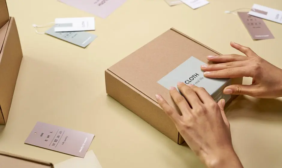
Adhesive labels serve as a powerful tool for brand visibility. With custom designs, vibrant colors, and logos, these labels help products stand out on the shelves while reinforcing brand identity. Consider the way vibrant colors and bold graphics draw attention, making it easier for consumers to identify and remember your brand amidst a sea of competitors. By incorporating unique designs, adhesive labels help brands create a lasting impression that lingers in the minds of consumers long after they have left the store.
Incorporating technology like NFC or RFID into adhesive labels can further enhance brand recognition by providing consumers with interactive experiences that connect them with the brand on a digital level. This additional layer of interaction not only brings the product to life but also strengthens the bond between the brand and its consumers, creating a more memorable experience.
2. Providing Essential Product Information
From ingredients to usage instructions, adhesive labels are key to conveying vital information to consumers, ensuring that they have all they need to make informed purchasing decisions. A well-designed label not only presents this information clearly but also in a way that is aesthetically pleasing, adding to the product’s overall appeal. This dual role of providing necessary data while enhancing visual appeal makes adhesive labels indispensable in modern packaging solutions. Moreover, these labels can also include QR codes that customers can scan to access even more detailed product information or instructional videos, providing a robust and interactive resource for making informed choices.
3. Facilitating Inventory Management
Labels play a crucial role in streamlining inventory processes by enabling quick scanning and identification, making stock management and retrieval faster and more efficient. By incorporating barcodes or QR codes, adhesive labels can help warehouse staff quickly identify and track products, reducing errors and improving operational efficiency. This is especially important for businesses with large inventories or those that deal with diverse product lines.
4. Enhancing Product Security
Tamper-evident adhesive labels provide an added layer of security, ensuring that consumers receive products in their intended, untampered form while enhancing trust. These labels not only assure consumers of the product’s integrity but also act as a deterrent against tampering and unauthorized alterations. In industries such as pharmaceuticals and food, where product safety is paramount, the use of these security labels is not just beneficial but often a necessity. They help maintain consumer trust and protect brand reputation by demonstrating a commitment to quality and safety.
5. Meeting Legal Requirements
Many industries are governed by regulations dictating what information must be displayed on packaging. Adhesive labels ensure compliance with these laws, avoiding potential legal issues. Whether it’s nutritional information, safety warnings, or country of origin, adhesive labels are the most effective way to communicate regulatory information clearly and concisely. Labels that don’t meet legal standards can lead to fines and recalls, making compliance an essential function of any packaging strategy.
6. Supporting Eco-friendly Initiatives
Many adhesive labels now incorporate sustainable materials and eco-friendly inks, aligning with environmentally conscious business practices and consumer preferences. In today’s market, sustainability isn’t just a trend; it’s a necessity. By choosing sustainable materials for labels, companies not only reduce their carbon footprint but also appeal to a growing segment of eco-conscious consumers. This commitment to sustainability can be a strong differentiator in competitive markets, positioning a brand as forward-thinking and responsible.
7. Increasing Shelf Appeal
Through creative design and high-quality printing, adhesive labels can capture consumer attention, making products more appealing and likely to be chosen over others. This visual appeal is crucial in crowded retail environments where consumers often make purchase decisions within moments. Investing in high-quality label design can thus directly contribute to increased sales by making a lasting first impression.
8. Enhancing Functionality for Consumers
Interactive labels, such as those with QR codes, offer added functionality, providing consumers with easy access to additional resources or information. This modern approach to labeling transforms a simple product package into an engaging tool. Consumers can access discount codes, instructional videos, or promotional content with a simple scan, making the shopping experience more enjoyable and informative.
9. Simplifying Product Differentiation
Labels allow for easy differentiation between different product lines or variants, aiding consumers in selecting the right product variant for their needs. This differentiation is crucial in product marketing, helping consumers clearly identify distinct features or benefits within a product range. When labels effectively highlight these unique selling points, they can drive consumer preference and boost brand loyalty.
10. Increasing Market Competitiveness
Well-designed adhesive labels can be a competitive advantage, distinguishing your brand from others in a crowded marketplace. They not only convey vital information but also encapsulating the brand’s story in a visually compelling way. As a result, these labels play a direct role in influencing consumer choice, often becoming the deciding factor between competing products.
11. Aiding in Logistics and Distribution
Logistical labels simplify the movement and tracking of goods throughout the supply chain, making the distribution process more efficient. By incorporating technologies like barcodes and RFID, companies can streamline logistics operations, reducing errors and improving the accuracy of shipments. This efficiency not only saves time but also reduces costs associated with logistics and handling.
12. Reducing Packaging Costs
As a cost-effective solution, adhesive labels can often be produced and applied at a fraction of the cost of other printing methods, reducing overall packaging expenses. This affordability doesn’t mean a sacrifice in quality—they can be customized to meet high aesthetic and functional standards. For businesses seeking to reduce overhead while maintaining quality, adhesive labels provide an optimal solution.
13. Improving Customer Experience
Labels can enhance the post-purchase experience by providing clear instructions or customer service information, thus building customer loyalty and satisfaction. By offering added value through informative content, such labels contribute to a positive consumer experience. In the long run, this positivity translates to repeat business and strong word-of-mouth referrals.
14. Supporting Limited Edition or Seasonal Products
Adhesive labels are perfect for special editions or seasonal products, allowing for easy and cost-effective updates to packaging for targeted promotions. This flexibility ensures that packaging can stay relevant and timely, quickly adapting to seasonal trends and consumer interests. Furthermore, limited edition packaging can become a collector’s item, giving products a special appeal and increasing demand.
15. Ensuring Product Authenticity
Labels with authenticity features, like holograms or unique codes, help verify the legitimacy of products, safeguarding against counterfeiting. In industries particularly vulnerable to fakes, such as pharmaceuticals and luxury goods, ensuring authenticity through secure labeling can protect both the brand and consumers. These features not only foster consumer trust but also reinforce the brand’s commitment to quality and integrity.

10 Innovative Tips for Adhesive Labels in Packaging
Packaging serves as the first impression for your product, and adhesive labels play a significant role in shaping that impression. Getting creative with your label design not only attracts customers but also enhances brand recognition. Here are some innovative tips to make the most of adhesive labels in packaging.

1. Embrace Eco-Friendly Materials
Using eco-friendly materials for your adhesive labels not only supports sustainability but also appeals to environmentally conscious consumers. Consider labels made from recycled paper or biodegradable materials. These choices not only contribute to reducing waste but also send a clear message about your brand’s commitment to the environment. Eco-conscious customers are increasingly looking for brands that align with their values, making the use of sustainable materials an essential competitive advantage in the market.
Moreover, opt for adhesives that are water-based or made from natural substances. These options are less harmful to the environment and ensure that your labels break down more easily without leaving a toxic residue. The move towards green practices, such as using sustainable adhesives, can certainly enhance your brand’s reputation, giving you a unique selling point that could be the deciding factor for many buyers.
2. Leverage Unique Shapes and Sizes
Break the mold of traditional label shapes by experimenting with unique designs. Irregular shapes or custom sizes can catch the eye and create a memorable brand experience. Instead of sticking to conventional rectangles or squares, you could explore die-cut labels that mimic your product’s shape or a thematic design that tells your brand story. Such creativity will draw attention and potentially increase your product’s shelf appeal significantly.
When customers see something unusual, it piques their curiosity, prompting them to learn more about what’s inside. This is a fantastic opportunity to intrigue potential buyers and make a lasting impression. For products with limited space, consider a wrap-around label that maximizes information while maintaining an aesthetically pleasing look. Incorporating dynamic shapes doesn’t just make your packaging stand out; it plays a crucial role in reinforcing brand identity.
3. Opt for Minimalistic Designs
A minimalistic approach can speak volumes. Simple yet elegant designs can communicate sophistication and clarity, ensuring that your message is conveyed efficiently. The idea is to focus on the essentials. By removing unnecessary elements, you allow critical information to stand out more prominently. This approach not only aligns with modern design trends but also aligns perfectly with the idea of decluttering to enhance visual appeal.
As consumers increasingly appreciate simplicity, cleaner designs communicate a sense of authenticity and transparency, values that resonate well with today’s audiences. Minimalistic labels are particularly effective in markets like fashion and tech, where understatement implies quality. They can evoke a sense of calm and invite consumers to appreciate what’s truly important about your product without distraction.
4. Incorporate QR Codes for Added Value
Enhance customer interaction by integrating QR codes into your labels. This allows consumers to access additional product information or promotional content with a simple scan. QR codes are a powerful tool to engage tech-savvy consumers, providing them direct access to a wealth of resources, from instructional videos to detailed ingredient lists. This can be particularly valuable in industries such as food and beverage, where transparency about product contents is essential to some consumers.
Imagine a customer picking up a product and with a quick scan, being able to read customer testimonials, view the product in action, or even receive a special discount on their next purchase. QR codes bridge the gap between the physical and digital, offering a versatile platform for brands to deliver interactive content. They’re not just about transmitting data; they’re about creating experiences and building deeper connections with your audience.
5. Use Color to Evoke Emotion
The right color scheme can evoke specific emotions and align with your brand’s identity. Choose colors that resonate with your product’s intent and target audience. Understanding color psychology is crucial; for instance, blue is often associated with trust and reliability, which can be beneficial for brands looking to build consumer trust. Meanwhile, red can evoke a sense of urgency or excitement, perfect for limited-time offers or bold product launches.
Colors can also denote flavors, scents, or experiences, playing a vital role in setting expectations before a product is even used. A harmonious color palette not only attracts attention to your product but reinforces brand recognition, essential in crowded markets. Think of how colorful packaging can instantly signal a fun, youthful vibe, while more subdued tones might suggest elegance and sophistication.
6. Experiment with Textures
Unique textures can make a huge difference in how labels are perceived. Consider using textured finishes like linen or matte to add a tactile dimension to your packaging. Engaging not only the eyes but also the sense of touch can create a more immersive and memorable product experience. Textured labels hint at quality and thoughtfulness, suggesting that your brand pays attention to detail and values high-quality production.
Textured labels encourage consumers to reach out, touch, and feel, which can result in a deeper connection to the product. The interplay of light on various surfaces can add depth, making your product stand out even before the package is opened. Utilizing texture creatively can enhance the perceived quality of your goods, turning a casual glance into a lingering interest.
7. Focus on Typography
Typography plays a crucial role in label design. Choose fonts that reflect your brand’s personality and ensure they are legible, both up close and from a distance. Typography isn’t just about choosing a font; it’s about communication. The style of the letters can convey a variety of emotions and connect with distinct consumer segments. Whether you’re going for elegance with a serif font or modernity with sans-serif, make sure it aligns with your brand ethos.
A well-thought-out typographic hierarchy can guide the consumer’s eye through the label, emphasizing what you want them to remember most. Pay attention to spacing, alignment, and size to ensure information is easy to digest. Great typography doesn’t just look good—it plays a strategic role in product appeal by guiding potential buyers through your product’s key characteristics and benefits succinctly.
8. Utilize Clear Labels for a Modern Look
Clear labels provide a modern and sleek look, allowing the product itself to be the star. This style works well for transparent or glass packaging. Using clear labels helps create a sophisticated and unassuming style that can draw attention to the product’s quality and contents, enhancing authenticity. Products like beverages, cosmetics, or artisanal goods benefit significantly from this approach as it keeps the overall aesthetic clean and chic while still delivering brand messaging.
9. Enhance with Foil Stamping
Foil stamping adds a touch of luxury and can make labels stand out. This technique is perfect for conveying premium quality and elegance. Whether you opt for gold, silver, or even holographic foil, this technique captures light beautifully and can underscore a sense of exclusivity. It’s excellent for high-end goods such as perfumes, wines, or gift packaging, where first impressions are everything.
Beyond aesthetics, foil stamping suggests durability and care. It’s a tactile and visual enhancement that demands attention. By elevating your packaging in this way, you align your brand with values of quality and attention to detail. Using foil stamping strategically can underscore key elements on your label, guiding the consumer’s focus to what’s most important.
10. Incorporate Interactive Elements
Engage your audience by including interactive elements like peel-off sections or scratch-and-sniff areas. These can create a unique and fun customer experience. Interactive elements invite consumers to actively participate in their engagement with the product, fostering a sense of discovery and joy. This can be especially impactful in industries geared towards children or novelty items, where surprise and enjoyment play a big role in purchasing decisions.
Such elements transform a simple transaction into an experiential journey. For example, scratch-and-sniff labels on gourmet food products can evoke the aroma of culinary delights, whetting the customer’s appetite even in the aisle. Peel-off sections can deliver additional content, such as fun facts, recipes, or promotional messages. Incorporating playfulness into your packaging can turn buyers into brand advocates, delightfully surprised by your thoughtful approach.

7 Luxury Packaging Ideas to Elevate Your Brand
In the world of luxury, presentation is everything. The packaging of your product can say so much about your brand—luxurious, sophisticated, and high-quality. If you’re looking to step up your brand game and make a lasting impression, consider these elegant packaging ideas that catch the eye and encapsulate the identity of your brand.

1. Embrace Minimalistic Elegance
Simplicity can be the ultimate sophistication. Minimalistic designs with a focus on clean lines and uncluttered spaces convey a sense of luxury and refinement. Often, less is more. By reducing clutter and focusing on the essentials, you draw attention to the quality of your product. The minimalistic approach offers a quiet confidence that speaks volumes without needing flashy elements. It allows your brand’s excellence to shine through effortlessly, proving that elegance doesn’t necessarily equate to excessive embellishment.
Consider the impact of whitespace. Utilizing negative spaces strategically can create a calming effect, allowing the consumer to focus more on the essential message and product itself. This technique helps in creating an understated, yet powerful presentation. Minimalistic designs are not just a trend but a timeless classic that resonates across different demographics, especially in the fast-paced lives of modern consumers who seek tranquility in simplicity.
2. Incorporate Sustainable Materials
Eco-friendly is the new luxury. Using sustainable materials not only appeals to environmentally conscious customers but also enhances the premium feel of your product. Customers increasingly prefer brands that prioritize sustainability, making it a key differentiator in the market. Sustainable materials such as recycled cardboard, biodegradable plastics, or innovative plant-based alternatives do more than just reduce environmental impact; they tell a story of responsibility and forward-thinking.
By integrating greener options, you align your brand with a global movement towards responsibility and ethics. This shift is not just beneficial for the planet but also adds value to your brand, potentially increasing customer loyalty. Utilizing eco-conscious approaches could also mean employing less wasteful processes, ultimately resonating with a core demographic that values sustainability as much as luxury.
3. Utilize Metallic Accents
A touch of metallic can add a lavish flair to packaging. Whether it’s through foiling, embossing, or using metallic inks, this detail can elevate the overall aesthetic. The shimmering allure of metallics can accentuate key features of your packaging, drawing in the eye and creating a luxurious first impression.
Gold, silver, and bronze are popular choices that never go out of style. These accents can be strategically used to highlight specific areas or logos, enhancing brand visibility. While the luminous sheen of metallic finishes is undeniably engaging, balance is crucial. When used sparingly, metallic accents enhance sophistication without overpowering the overall design, ensuring that the packaging remains elegant rather than gaudy.
4. Make Use of Custom Typography
Custom fonts can differentiate your brand. Consider using unique typography that aligns with your brand identity to create an immediate visual impact. Typography is more than just text; it is an integral part of your brand’s voice and visual identity. A carefully chosen font can communicate much about your brand’s personality, values, and style.
Investing in custom font design can result in a signature look that stands out in a crowded market. Whether you opt for classic elegance or contemporary flair, typography can enhance readability while simultaneously capturing the essence of your brand. Brand-specific typography reinforces your messaging every time a customer engages with your product, adding a layer of distinctiveness that can set your packaging apart.
5. Incorporate Unique Textures
Textured packaging adds depth and interest, inviting customers to touch and engage with the product in a more intimate way. The tactile experience can greatly enhance the perception of luxury, as it involves more of the customer’s senses, making the interaction with the product more memorable.
Innovative textures such as soft-touch finishes, raised patterns, or linen weaves can distinguish your packaging. These textures invite the consumer to explore beyond the visual appeal, offering a sensory journey that can set your product apart on the shelf. Textured elements can also suggest premium quality, reflecting the luxurious nature of what’s contained within.
6. Focus on Personalization
Personalized elements can make your packaging feel special. Consider customizable options or personalized messaging to create a connection with your customers. In today’s marketplace, personalization can enhance the consumer experience by making them feel valued and understood, thus fostering brand loyalty.
Tech advancements have made personalization more accessible than ever. Digital printing and variable data printing allow for customization at scale, enabling you to offer personalized messages or names seamlessly and cost-effectively. Whether it’s a bespoke design for a special occasion or an interactive element that engages the customer, personalization adds a level of exclusivity that speaks directly to an individual’s personal tastes and preferences.
7. Design with Color Psychology
Colors evoke emotions. Choosing a color palette strategically can evoke the desired emotions and enhance the luxurious feel of your packaging. Understanding color psychology can aid in selecting hues that resonate with your target audience and align perfectly with your brand message.
For instance, using deep velvet blues might evoke a sense of trust and reliability, whereas gold can signify luxury and indulgence. Balancing these colors with neutral tones creates an elegant backdrop that can help highlight the primary colors more effectively. Consistency in color scheme across all marketing channels and packaging solidifies brand identity and strengthens brand recognition, reinforcing the luxurious experience at every touchpoint.

9 Innovative Packaging Solutions to Boost Product Sustainability
In today’s eco-conscious world, businesses are increasingly seeking ways to reduce their environmental impact. One significant step is adopting innovative packaging solutions that promote sustainability. Let’s explore some creative strategies that can help make your product more eco-friendly.
1. Biodegradable Materials
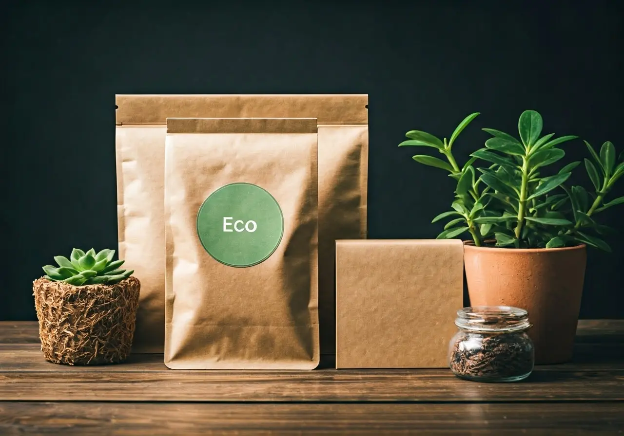
Utilizing biodegradable materials for packaging is an excellent way to ensure your products leave a minimal impact on the environment. These materials break down naturally, reducing waste and promoting a cleaner planet. Unlike conventional plastics, biodegradable options can decompose in safe conditions, often aided by micro-organisms, creating a closed-loop system that benefits the environment. This innovation not only aligns with environmental stewardship but also showcases your brand’s commitment to sustainability. Innovative packaging solutions for sustainability are always advancing, making it easier to incorporate these materials into your product line.
2. Recycled Content Utilization
Incorporating recycled materials into your packaging not only conserves resources but also demonstrates a commitment to sustainable practices. This approach helps reduce the need for virgin materials and lowers the overall environmental footprint. Recycled content flexible packaging is key to a sustainable journey—using PCR materials in bar wraps and pouches increases demand for recycled materials and helps close the loop on waste management.
It’s crucial for brands to highlight their use of recycled materials as part of their marketing strategy. Today’s consumers are increasingly eco-aware and prioritize products that contribute positively to the environment. Showcasing your commitment to recycled content can enhance brand loyalty and expand your consumer base. Moreover, using recycled materials can also reduce manufacturing costs, as these materials typically require less energy to produce compared to new materials.
3. Minimalist Design
Opting for a minimalist packaging design is an effective way to cut down on excess material usage. This streamlined approach not only reduces waste but also often results in cost savings. A minimalist design focuses on using only what is necessary, emphasizing quality over quantity. This method is part of a broader sustainability trend in snack packaging, where less clutter and straightforward messaging are becoming the norm. Minimalist designs allow brands to communicate what truly matters, helping to enhance product attractiveness and encourage consumer purchasing.
4. Reusable Packaging
Encouraging customers to reuse packaging can greatly extend its lifecycle. By designing packaging that has functional uses beyond its initial purpose, you add value and reduce waste. This innovative approach transforms packaging from being a single-use item to one that has repeated value, thus significantly reducing the demand for new materials. Consumers appreciate packaging that they can repurpose, and this value-added benefit can enhance customer loyalty. For more on how reusability ties into broader packaging trends, check out the top trends in blister packaging design.
Brands are adopting clever designs that allow packaging to be reused in versatile ways, such as turning containers into storage solutions after their initial use. This form of packaging encourages a sustainable mindset within consumers, illustrating that every part of a product can have a prolonged life if used thoughtfully.
5. Compostable Packaging Options
Compostable packaging is designed to break down in composting conditions, completing its journey back to nature. This option provides a natural end-of-life solution for packaging waste. Unlike conventional methods, compostable materials like plant-based plastics or paper products can be returned to the earth, enriching soil quality instead of lingering in a landfill. Using compostable materials aligns your brand with the values of environmental sustainability, appealing to an audience intent on reducing their carbon footprint. With advances in innovative packaging solutions, making the shift to compostable options has become more accessible than ever.
6. Edible Packaging Innovations
Edible packaging offers a unique solution by eliminating waste altogether. These materials are safe to consume and can provide a cutting-edge addition to your product line. Imagine a scenario where your packaging becomes part of the dining experience, forming an integral connection between the product and its packaging. Such innovations can particularly benefit the food industry, providing companies with a novel way to attract attention and delight eco-conscious consumers. Although still in the experimental stage, innovative solutions in sustainable packaging are increasingly making this concept a viable option for mainstream applications.
7. Plant-Based Plastics
Derived from renewable resources, plant-based plastics offer a sustainable alternative to traditional plastics. They reduce reliance on fossil fuels and can be an essential part of your eco-friendly strategy. With environmental concerns growing, consumers are keen to support brands that make tangible steps towards sustainability. By using plant-based plastics, you can significantly lessen your environmental impact and establish your brand as an advocate for green initiatives. For a comprehensive view of our sustainable offerings, explore our RENEW™ family of products which offer FDA-approved sustainable solutions without compromising on quality.
8. Water-Soluble Materials
These materials dissolve in water, reducing permanent waste. Water-soluble options are great for specific applications, providing both convenience and environmental benefits. They are particularly valuable for products such as detergents or cleaners, where the packaging dissolves in use, leaving no traces behind. This innovative approach ensures that your packaging is not contributing to long-term pollution, thus supporting closed-loop systems for sustainable living. As more consumers become environmentally conscious, offering water-soluble packaging can put your brand at the forefront of innovation.
9. Innovative Refill Systems
Refill systems encourage consumers to reuse packaging by offering convenient refills. This approach reduces single-use packaging and is increasingly popular among eco-conscious shoppers. Providing a refill option not only minimizes waste but also promotes a circular economy by fostering a sustainable lifecycle for your products. It’s an appeals a growing segment of consumers who prioritize environmentally sustainable choices in every aspect of their purchase. For the latest trends and insights into sustainable packaging innovations, visit Innovative Packaging Solutions.